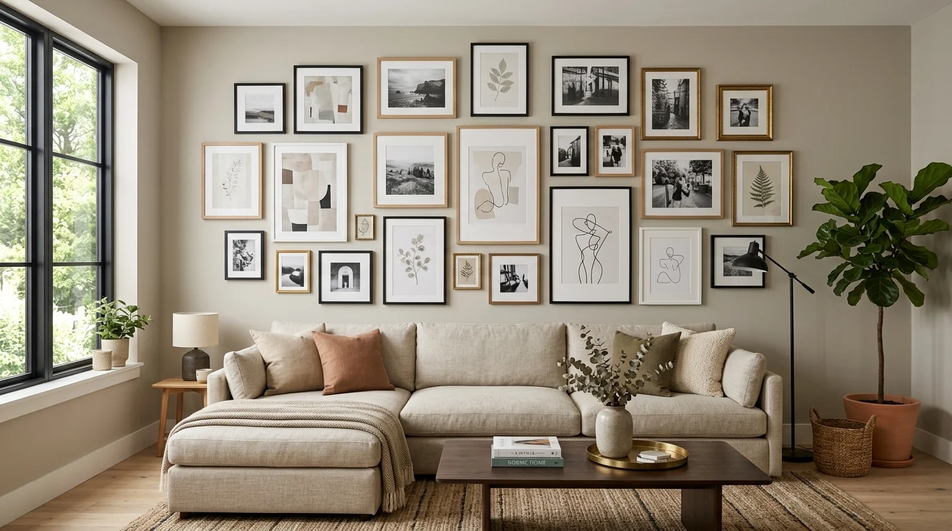
My first attempt at mixing frame styles on a gallery wall involved literally every frame I already owned, ornate gold, thin black metal, a chunky natural wood one, a couple of mismatched thrift store finds, all hung together with no real logic beyond having enough pieces to fill the wall. The result looked less like an intentionally eclectic collection and more like a wall where several unrelated decorating decisions had simply collided. It took starting over, with an actual strategy for how the different styles and sizes would relate to each other, before that same mix of frames finally looked like a deliberate, curated choice rather than an accident.
Mixing frame styles and sizes can create one of the most visually rich, personal gallery wall looks available, but it requires more intentional planning than a uniform arrangement does. Here’s how to actually make a mixed arrangement work.
Establish one consistent element to anchor the variety
When mixing multiple frame styles, sizes, and sometimes colors, establishing at least one consistent thread running through the entire arrangement prevents the mix from tipping into visual chaos. This consistent element could be a shared color family across otherwise different frame finishes, black and dark bronze frames mixed together rather than black and bright gold, a consistent mat board color even as frame styles vary, or a unifying theme within the art itself, all black-and-white photography, for instance, even within very differently styled frames.
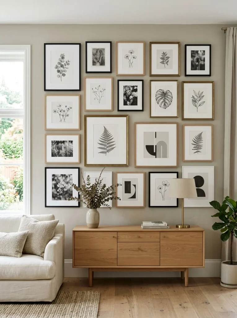
Limit your frame color palette even while varying styles
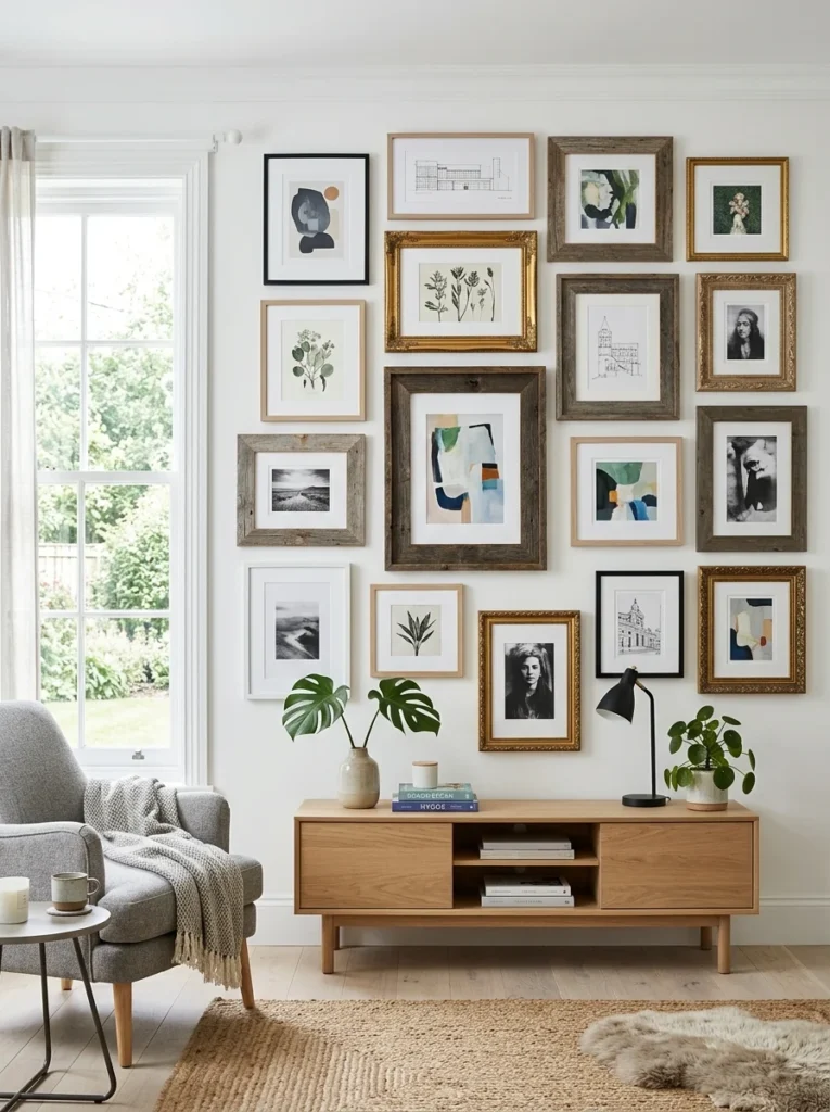
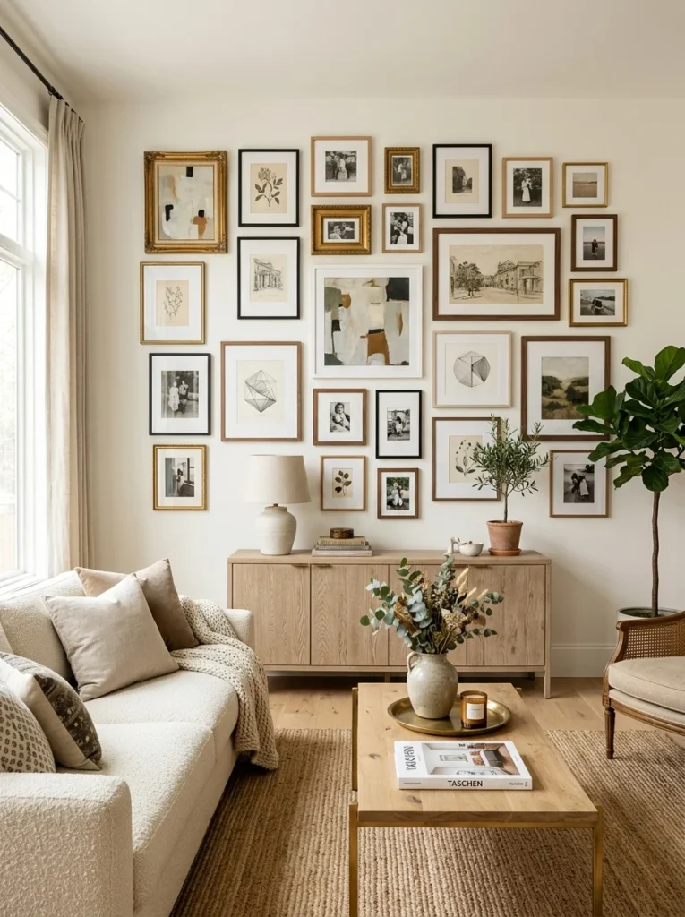
Mixing frame styles, ornate, simple, modern, vintage, works considerably better when the actual color palette across those different styles stays limited, generally two to three frame colors maximum throughout the whole arrangement. A gold ornate frame, a simple black metal frame, and a natural wood frame can coexist beautifully if that’s the extent of the color variation, but adding a fourth or fifth distinct frame color into the same mix starts to undermine the sense of intentional curation.
This principle is what my own first failed attempt was missing entirely, since I was mixing frame styles and an unlimited range of frame colors simultaneously, with no consistent thread tying any of it together.
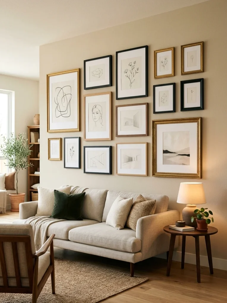
Group similar sizes together within the broader mixed arrangement
Rather than scattering every size randomly throughout the arrangement, clustering a few similarly sized frames together in one section of the wall, even while mixing their styles within that cluster, creates pockets of visual rhythm that make the overall arrangement easier for the eye to read. A completely random distribution of every size throughout the entire wall, with no groupings or rhythm at all, can look more chaotic than a mix that still maintains some loose organizational logic beneath the surface variety.
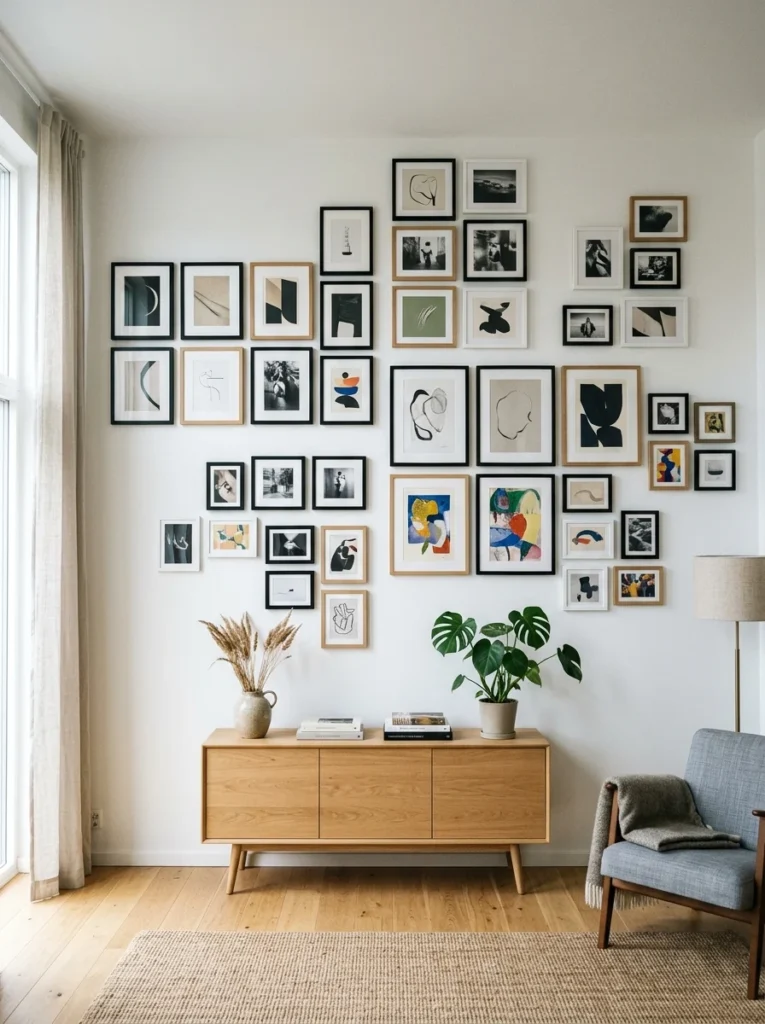
Use one larger anchor piece to ground the smaller, varied frames
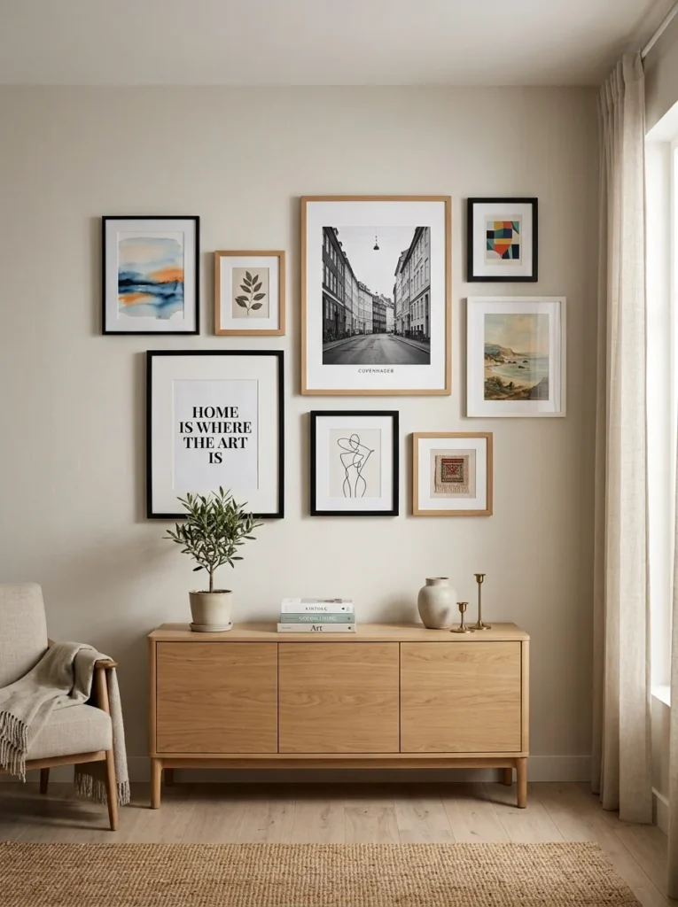
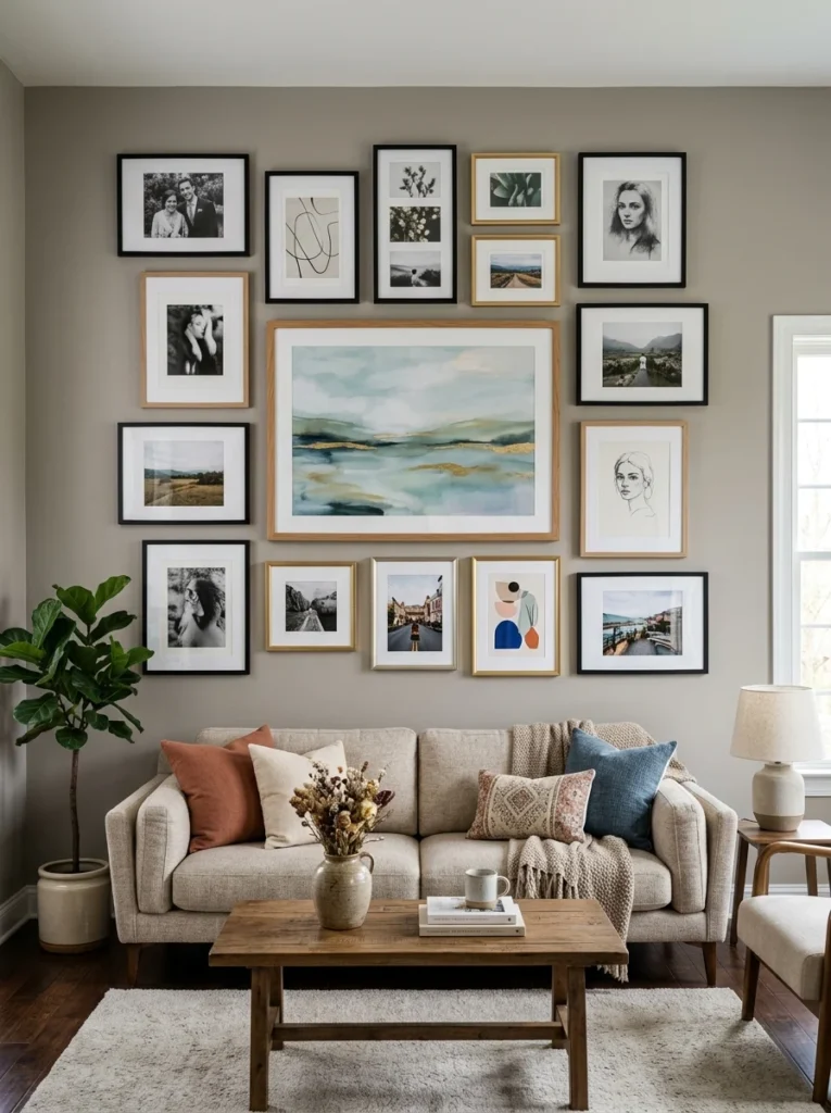
Choosing one significantly larger piece, in whatever style you like best, as the anchor of the arrangement, then building smaller, more varied frames around it, gives the eye a clear starting point and prevents an arrangement made up entirely of similarly small and medium pieces from feeling directionless. This anchor piece doesn’t need to match any of the surrounding frames stylistically, but its larger scale alone provides a natural visual weight that organizes the rest of the arrangement around it.
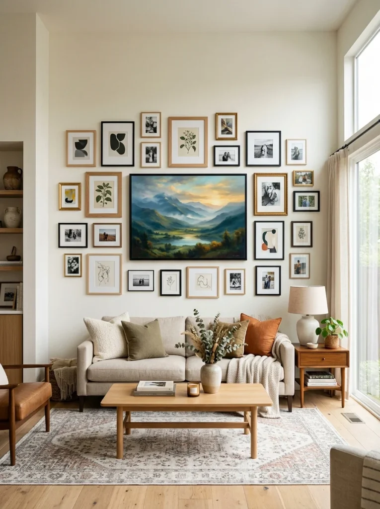
Balance ornate frames with simpler ones rather than clustering all the busy pieces together
If your mix includes both ornate, detailed frames and simpler, cleaner ones, distributing the more visually busy pieces throughout the arrangement, rather than clustering them all in one spot, prevents any single area of the wall from feeling overwhelmingly detailed while another area feels comparatively bare. This distribution helps the overall visual weight and busyness feel balanced across the entire arrangement rather than concentrated unevenly.

Consider mixing frame styles but keeping mat board treatment consistent
Using a consistent mat board color and width across every framed piece, even as the actual frame styles vary considerably, provides a subtle but effective unifying thread that ties a visually diverse mix together. White or off-white mats, in particular, tend to work well as this consistent element, since they’re neutral enough to complement almost any surrounding frame style without competing with either the frames or the art itself.
Don’t be afraid to include non-frame elements within the mix
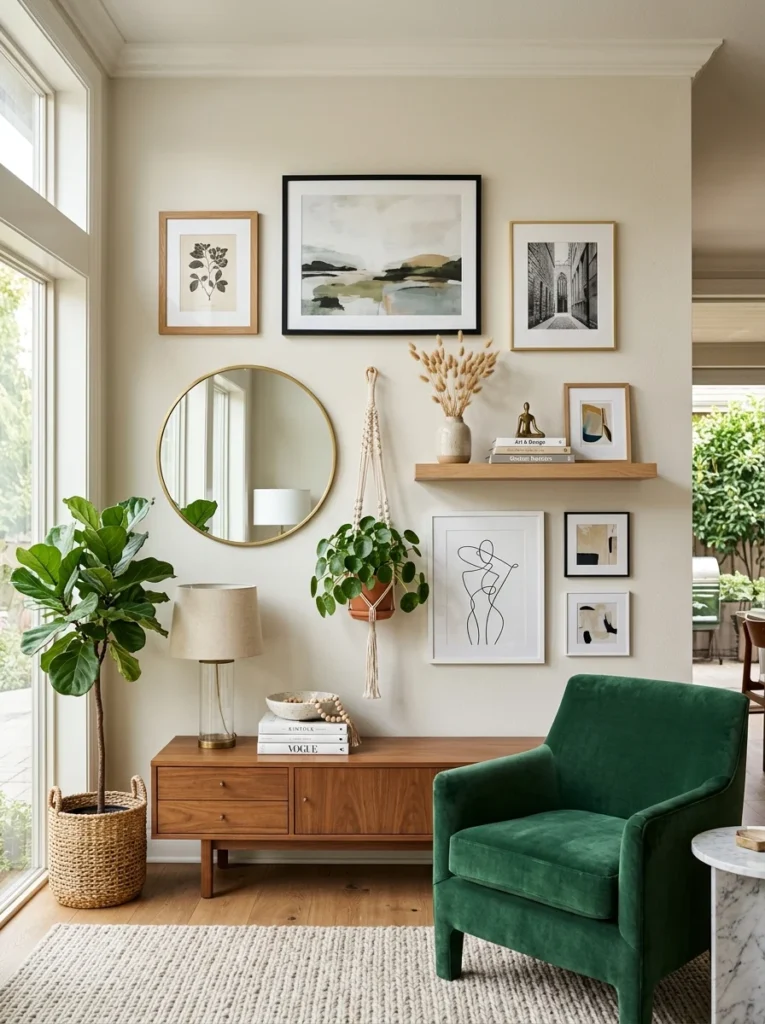
A well-planned mixed gallery wall doesn’t need to consist purely of framed art; incorporating a small shelf, a piece of unframed art clipped to a simple wood strip, or even a small mirror alongside traditional frames adds additional texture and variety, provided these non-frame elements still relate back to whatever consistent thread, color palette or general style sensibility, ties the rest of the arrangement together.
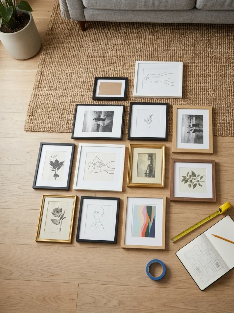
Plan the layout on the floor before committing to any hanging
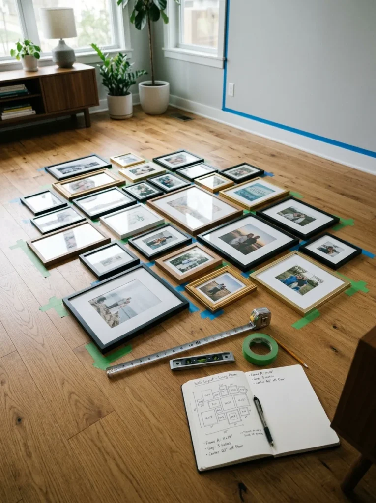
Mixed arrangements, precisely because they involve more variables, different sizes, styles, and sometimes colors, benefit even more than a uniform gallery wall from being laid out completely on the floor first, allowing you to experiment with different groupings, anchor placements, and distributions of ornate versus simple pieces before committing to any actual wall placement. This step is what ultimately saved my own second attempt from repeating the mistakes of the first.
Maintain consistent spacing even within a deliberately varied arrangement
Regardless of how much the frame styles and sizes vary, maintaining a consistent gap, generally two to three inches, between each piece throughout the arrangement provides an underlying sense of order that keeps the visual variety feeling intentional rather than sloppy. This consistent spacing is one of the most important unifying elements available, since it applies universally regardless of how different the actual frames and sizes are from one piece to the next.
Keep hanging hardware and hook placement consistent for a cleaner look
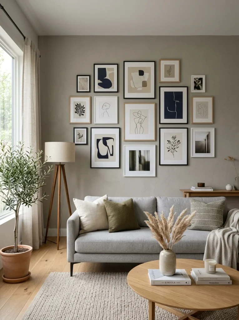
While the frames themselves can vary considerably in style and size, using consistent hanging hardware, the same type of hook or nail throughout the arrangement, and paying attention to keeping each piece hung at a consistent depth from the wall, helps the overall arrangement feel more considered even amid the visual variety of the frames themselves. This is a small, easily overlooked detail, but inconsistent hanging depth or an obviously mismatched hook peeking out from behind different frames can subtly undermine an otherwise well-planned mixed arrangement.
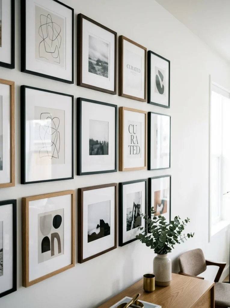
Mix vertical and horizontal orientations thoughtfully
A mixed gallery wall often includes both vertically and horizontally oriented pieces, and balancing these orientations throughout the arrangement, rather than clustering all the vertical pieces in one area and all the horizontal ones in another, helps the overall composition feel more dynamic and considered. A horizontally oriented anchor piece paired with a mix of vertical and horizontal smaller pieces around it, for instance, tends to create a more visually interesting composition than an arrangement where every piece shares the exact same orientation throughout.
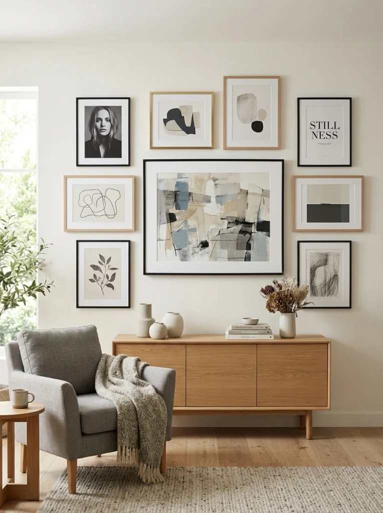
Use odd numbers of frames within smaller sub-groupings
Within a larger mixed arrangement, grouping frames in odd numbers, three or five pieces clustered together rather than an even number, tends to read as more visually dynamic and intentional than even-numbered groupings, which can sometimes feel overly symmetrical or predictable within an otherwise eclectic mix. This is a subtle design principle borrowed from broader styling practices, but it applies just as well to organizing smaller clusters within a larger, varied gallery wall arrangement.
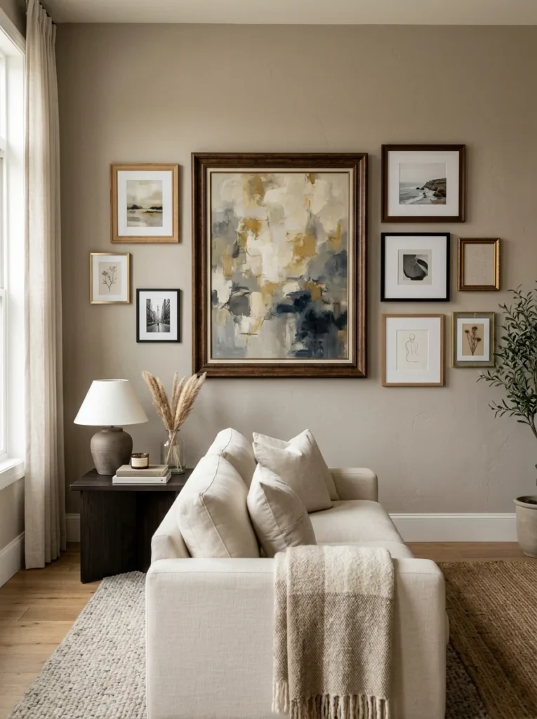
Step back frequently during the planning and hanging process
When working with a genuinely varied mix of styles and sizes, it’s easy to get absorbed in the details of individual frame placement and lose sight of how the overall arrangement reads from a normal viewing distance. Stepping back regularly, both during the floor-planning stage and throughout the actual hanging process, to view the arrangement from across the room rather than up close, helps catch any imbalances, an area that’s grown too visually heavy, a size distribution that’s drifted away from the original plan, before they become permanent, hard-to-fix problems in the finished wall.
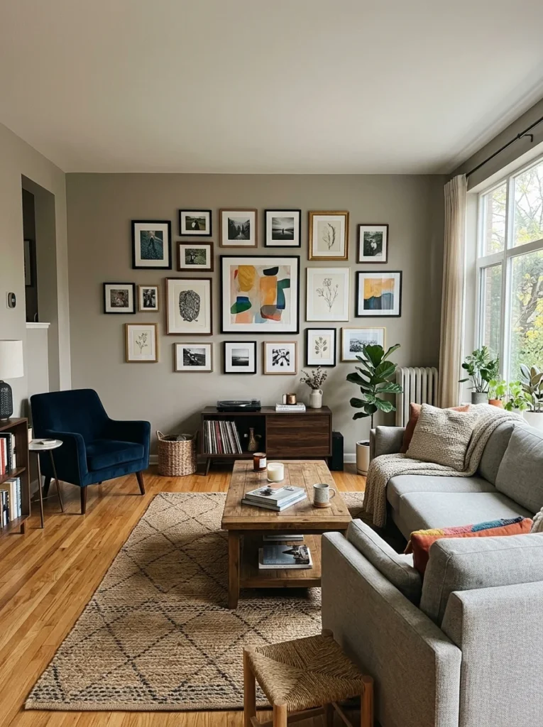
Should I group frames in odd or even numbers within a gallery wall?
Odd-numbered groupings, three or five frames clustered together, tend to read as more visually dynamic and intentional than even-numbered groupings, which is a subtle styling principle worth applying to smaller sections within a larger, mixed arrangement.
How do I balance vertical and horizontal frames in a mixed arrangement?
Distributing both orientations throughout the arrangement, rather than clustering all vertical or all horizontal pieces in one area, creates a more dynamic, considered composition than an arrangement where every piece shares the same orientation.
Common mixed gallery wall questions
How many different frame colors should I mix in one gallery wall?
Generally limiting yourself to two or three frame colors throughout the entire arrangement, even while varying the actual frame styles more broadly, keeps a mixed gallery wall feeling intentional rather than chaotic.
Do all the frames in a mixed gallery wall need to be similar sizes?
No, but grouping similarly sized frames together within sections of the broader arrangement, and using one larger anchor piece to ground the overall composition, helps create visual rhythm that a completely random size distribution throughout the wall often lacks.
What’s the easiest way to unify a mix of very different frame styles?
Using a consistent mat board color and width across every piece, regardless of how much the actual frames vary in style, provides one of the simplest and most effective unifying threads available for a visually diverse arrangement.
Should I plan a mixed gallery wall layout before hanging anything?
Yes, laying out the full mixed arrangement on the floor first is even more valuable for a varied collection than for a uniform one, since it lets you experiment with groupings, anchor placement, and the distribution of ornate versus simple pieces before any commitment to the actual wall.
Variety with an underlying order
Successfully mixing frame styles and sizes in a gallery wall comes down to establishing at least one consistent thread, a limited color palette, consistent mat boards, or consistent spacing, running beneath the surface variety, then organizing that variety with intentional groupings and a clear anchor piece rather than scattering everything randomly. The mix should feel curated, not accidental.
My own second attempt at this mixed arrangement used almost the exact same frames as my failed first one, just organized with an actual strategy behind the variety, and the difference in how intentional the final result looked was dramatic. If your own mixed gallery wall attempt feels more chaotic than curated, look for whether there’s any consistent thread tying the variety together; that missing element is very likely what’s making the difference between looking accidental and looking genuinely well-designed.