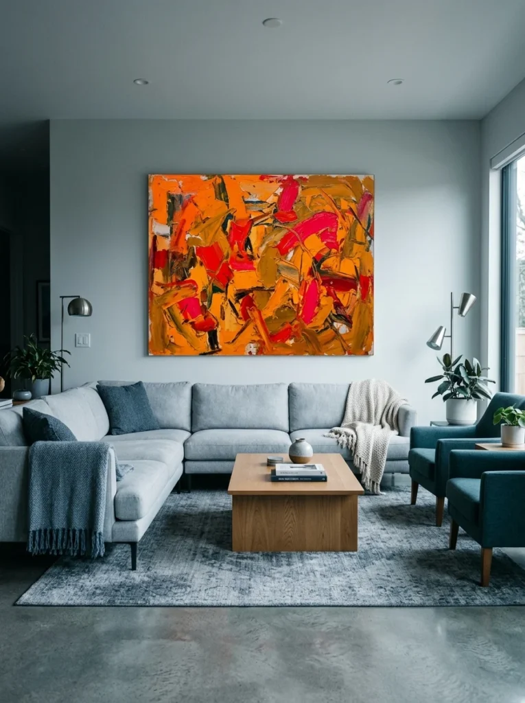
I once bought a large abstract print purely because I loved it in the gallery, a bold piece full of oranges and deep reds, and brought it home to a living room built almost entirely around cool blues and greys. It never stopped being a beautiful piece on its own, but hung in that room, it looked like it had wandered in from a completely different house. I eventually moved it to a small reading nook with warmer tones that actually suited it, and the difference was immediate, the same piece of art suddenly looking intentional rather than out of place. That experience taught me that even genuinely great art needs to actually relate to its surroundings to do its job well in a specific room.
Choosing wall art that works with your home’s color palette isn’t about only buying art in your exact wall color; it’s about understanding a few genuine principles of color relationships so your art enhances the room rather than fighting against it. Here’s how to think through that process.
Start by identifying your room’s dominant and accent colors
Before shopping for art, identify your room’s actual color structure: the dominant color, usually the walls and largest furniture pieces, and the accent colors already present in smaller doses, throw pillows, a rug, other decorative objects. Art doesn’t need to match the dominant color directly, but understanding this existing structure gives you a clear framework for deciding whether a new piece should echo, complement, or intentionally contrast with what’s already there.
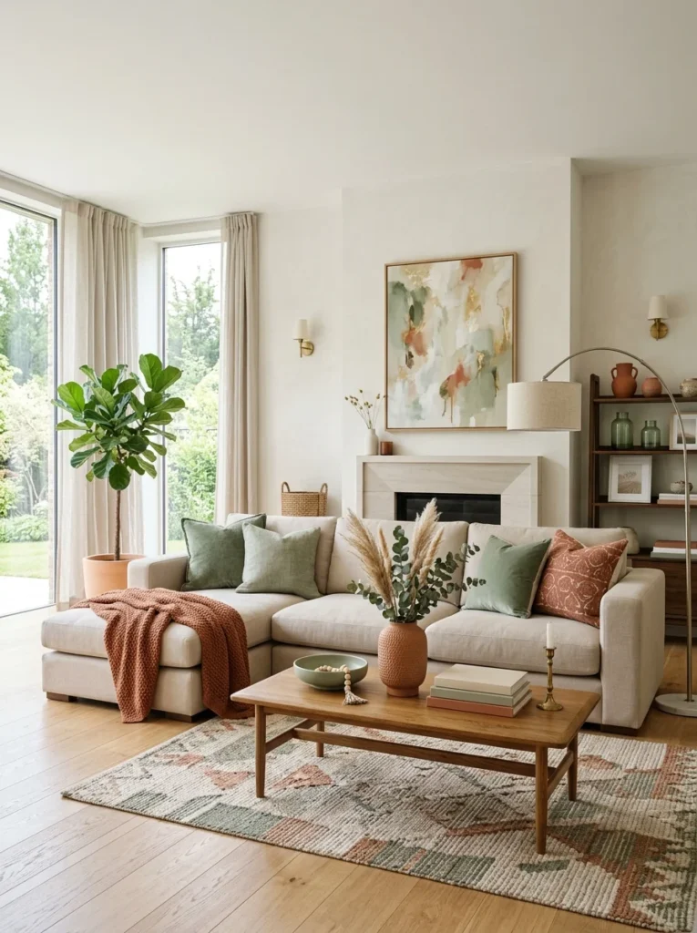
Choose art that pulls from your existing accent colors
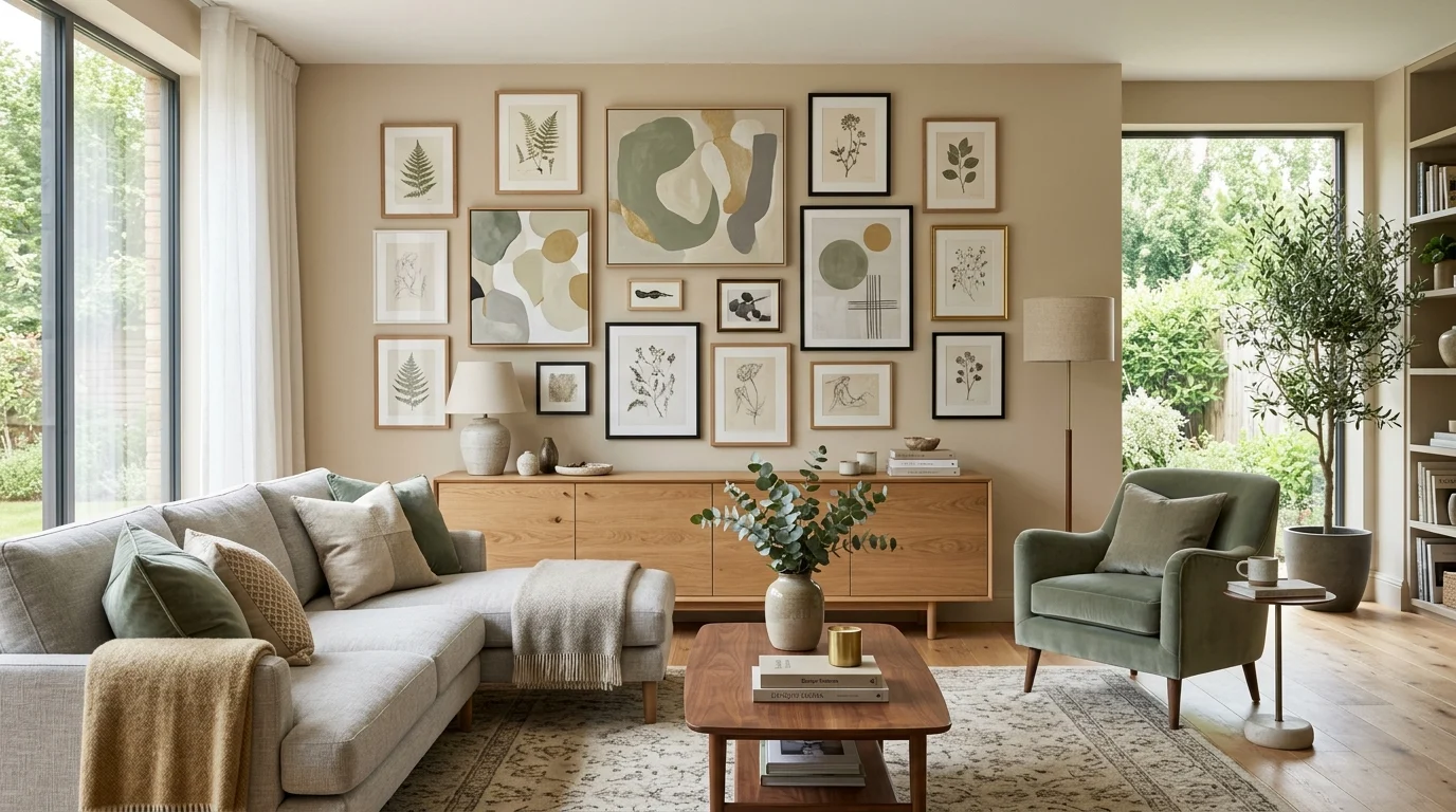
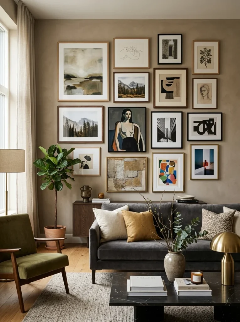
One of the most reliable approaches is choosing art that contains one or more of the accent colors already present elsewhere in the room, even in a completely different proportion or context than how that color currently appears. A piece of art with a small touch of the same terracotta already found in your throw pillows, for instance, creates a subtle, cohesive thread throughout the room without requiring the art to match anything directly or dominate the space with that color itself.
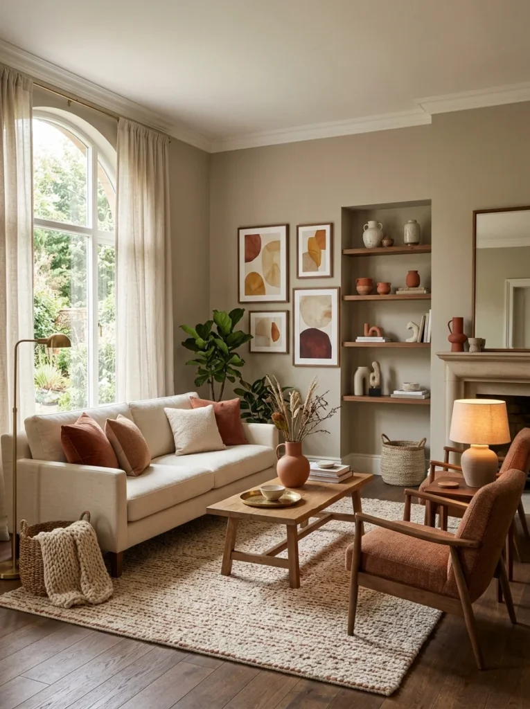
Understand complementary versus analogous color relationships
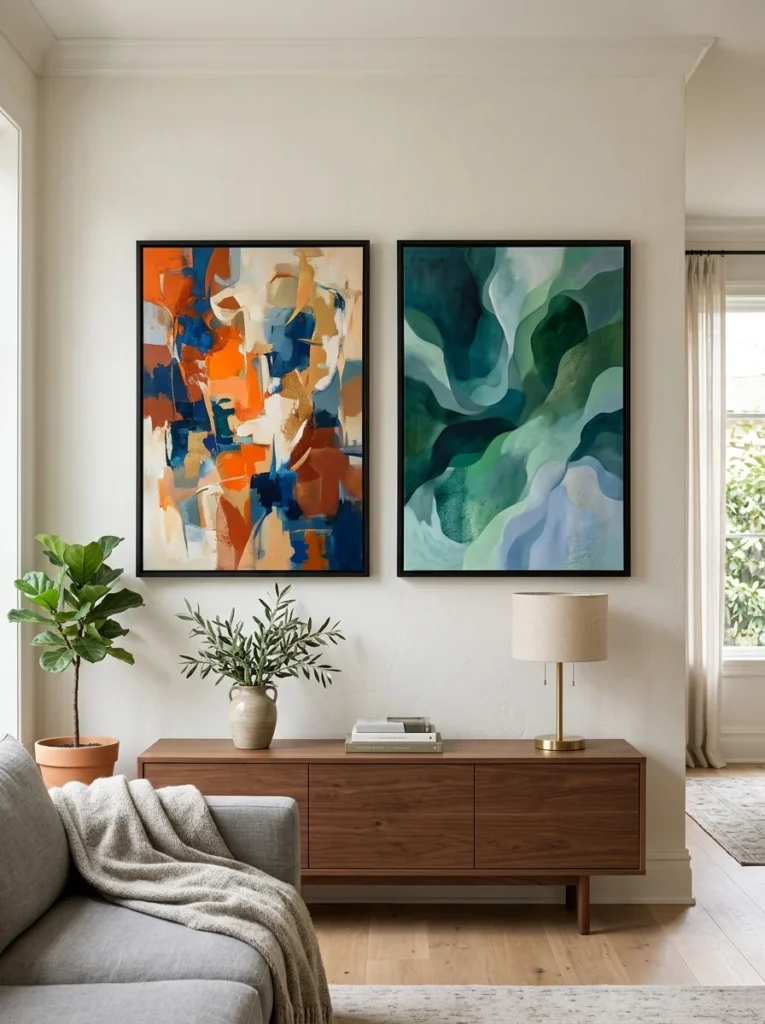
Complementary colors, sitting opposite each other on the color wheel, blue and orange, red and green, purple and yellow, create a vibrant, high-contrast relationship when paired together, which can work beautifully in art chosen deliberately to energize a room built around one of those colors. Analogous colors, sitting next to each other on the wheel, blue and green, red and orange, create a calmer, more harmonious relationship, which suits art meant to blend more seamlessly into an already-established palette rather than provide a bold contrast.
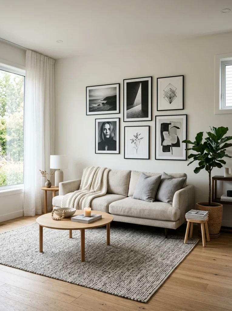
Consider a neutral or monochromatic piece as a safe, versatile choice
If you’re genuinely uncertain or simply want a safer choice, black-and-white photography, line drawings, or art rendered in tones very close to your existing wall color offers a nearly foolproof way to add visual interest without any risk of clashing with your room’s palette. This approach also ages well over time, since a monochromatic piece rarely feels as dated or as tied to a specific color trend as a boldly colored piece chosen for a very specific palette moment might.
Use art to introduce a color you want more of in the room
Art offers a lower-commitment way to introduce a color into a room than repainting a wall or buying new furniture, which makes it a useful tool for testing whether you actually want more of a specific color present, rather than committing to that color in a larger, more permanent way first. If you’re drawn to a certain shade but hesitant to paint an entire wall in it, choosing art that features that color prominently lets you live with it in the room before making a bigger commitment.
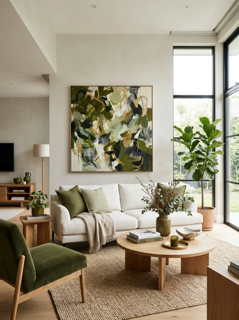
Match the art’s overall tone and warmth to the room’s lighting
A room with warm, yellow-toned lighting or a lot of natural afternoon light tends to suit art with correspondingly warm undertones, while a room with cooler, blue-toned lighting or consistently indirect north-facing light often pairs better with art carrying cooler undertones. Art that clashes with a room’s inherent lighting temperature, even if the actual pigments would theoretically work in different lighting, can look subtly off in a way that’s hard to pinpoint without understanding this underlying cause.
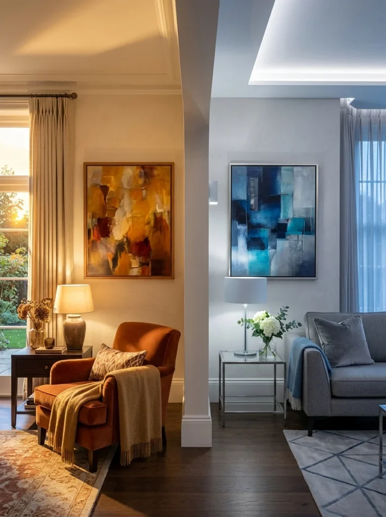
Don’t feel obligated to match every single color exactly
A common overcorrection is choosing art that matches the room’s existing colors so precisely that it ends up looking flat and unremarkable rather than adding genuine visual interest. Good art in a well-coordinated room usually shares a color relationship with its surroundings, echoing, complementing, or intentionally contrasting, rather than replicating the palette so exactly that it disappears into the background instead of contributing something to the room.
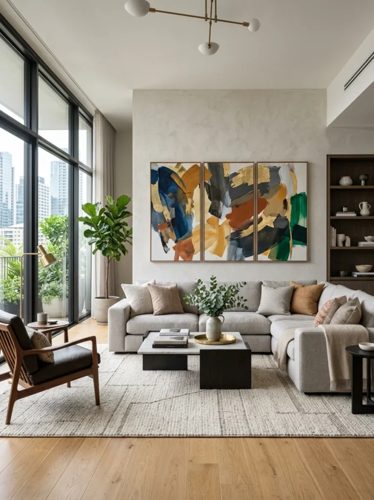
Consider the emotional tone you want each specific room to convey
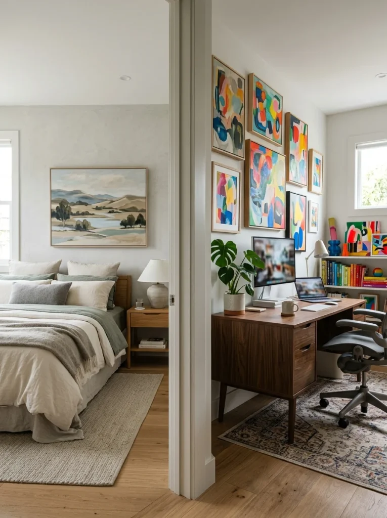
Beyond pure color coordination, think about the mood each room is meant to evoke: a bedroom might benefit from calmer, more muted art that supports rest, while a home office or a social living space might benefit from more energizing colors and bolder compositions. This emotional consideration should work alongside the purely technical color-matching principles, since art that’s technically coordinated with the room’s palette but emotionally mismatched to the room’s actual function can still feel subtly wrong even when the colors themselves are working correctly.
Test with printed samples or digital mockups before committing
Before purchasing a significant piece of art, print a small color sample or use a digital room-visualization tool, many retailers now offer these, to see how the piece’s actual colors interact with your specific wall color and lighting before committing to a purchase, particularly for anything expensive or difficult to return. Colors can shift meaningfully between how they appear in a product photo, under different lighting, and in person, so this extra step helps avoid the kind of mismatch I experienced with my own impulsively purchased piece.
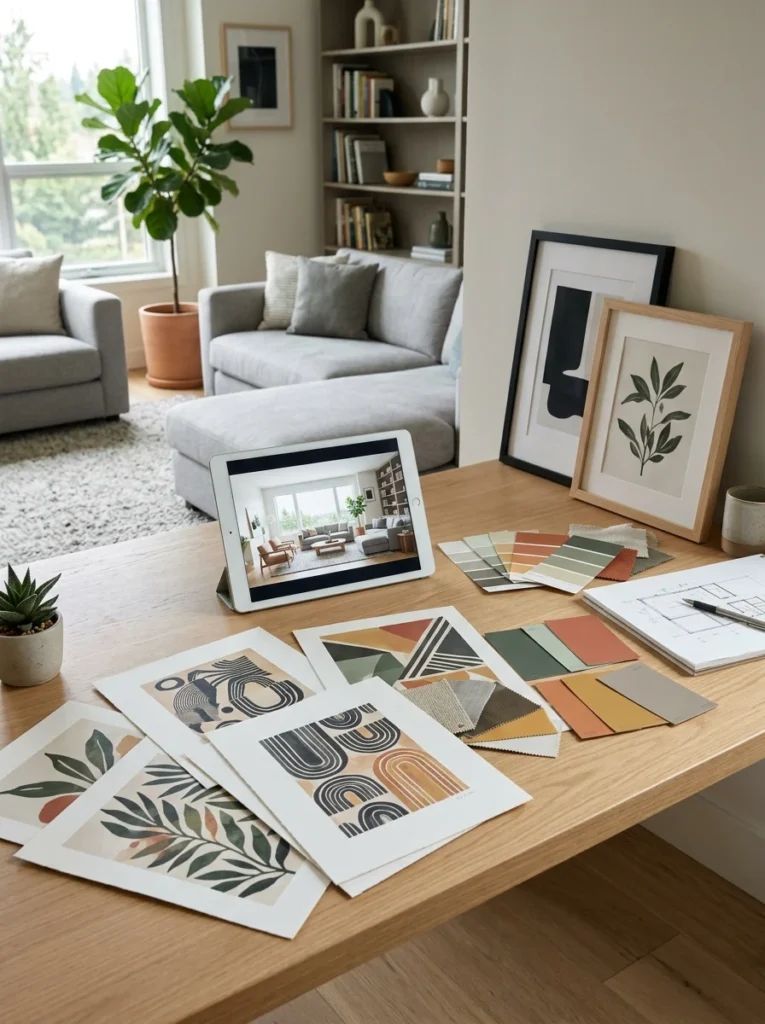
Let one statement piece set the palette for a whole room being designed from scratch
If you’re designing a room from the ground up rather than trying to match art to an already-established palette, choosing your art or a key piece first, then building the room’s wall color, furniture, and textiles around the colors present in that piece, can be a genuinely effective approach. This works particularly well when you have one piece of art you love enough to want it as the room’s clear centerpiece, letting everything else support and complement it rather than the other way around.
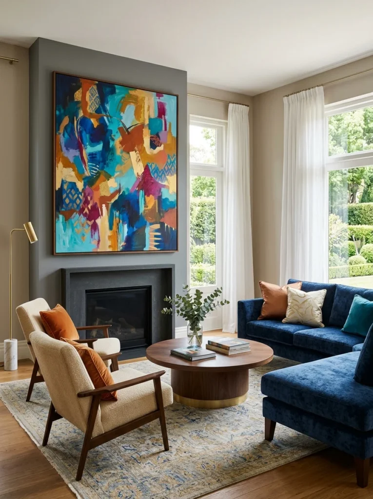
Coordinate the frame color alongside the art itself
The frame surrounding a piece of art plays its own role in how well the whole piece integrates with a room’s palette, sometimes just as much as the art inside it. A warm wood frame around a cool-toned piece can create a subtle tension, while a frame color that echoes another metal or wood tone already present in the room, existing furniture legs, door hardware, a lamp base, ties the piece into the broader room more effectively than focusing purely on the art’s internal colors and ignoring the frame entirely. When shopping for framed art or having a piece custom framed, treat the frame choice as part of the overall color decision rather than an afterthought decided purely on what’s available or cheapest.
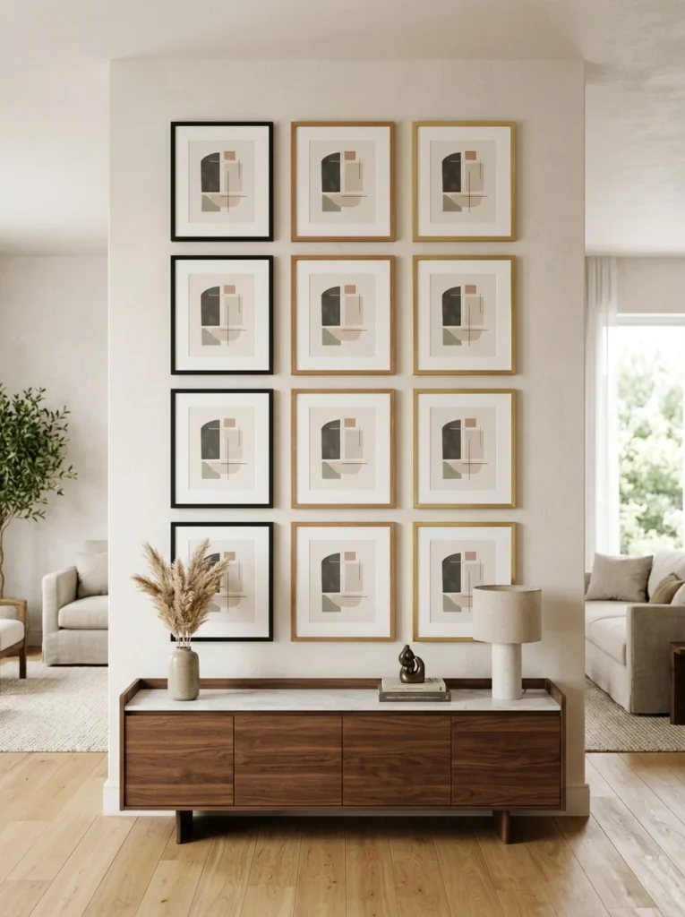
Think about consistency across visually connected rooms
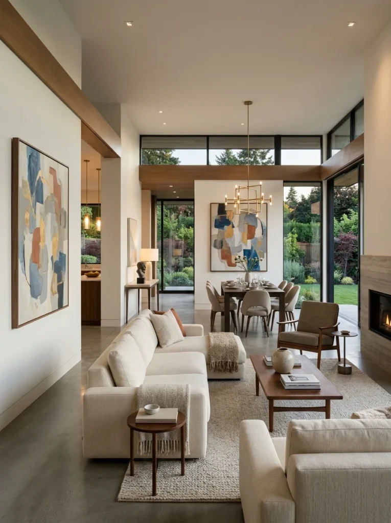
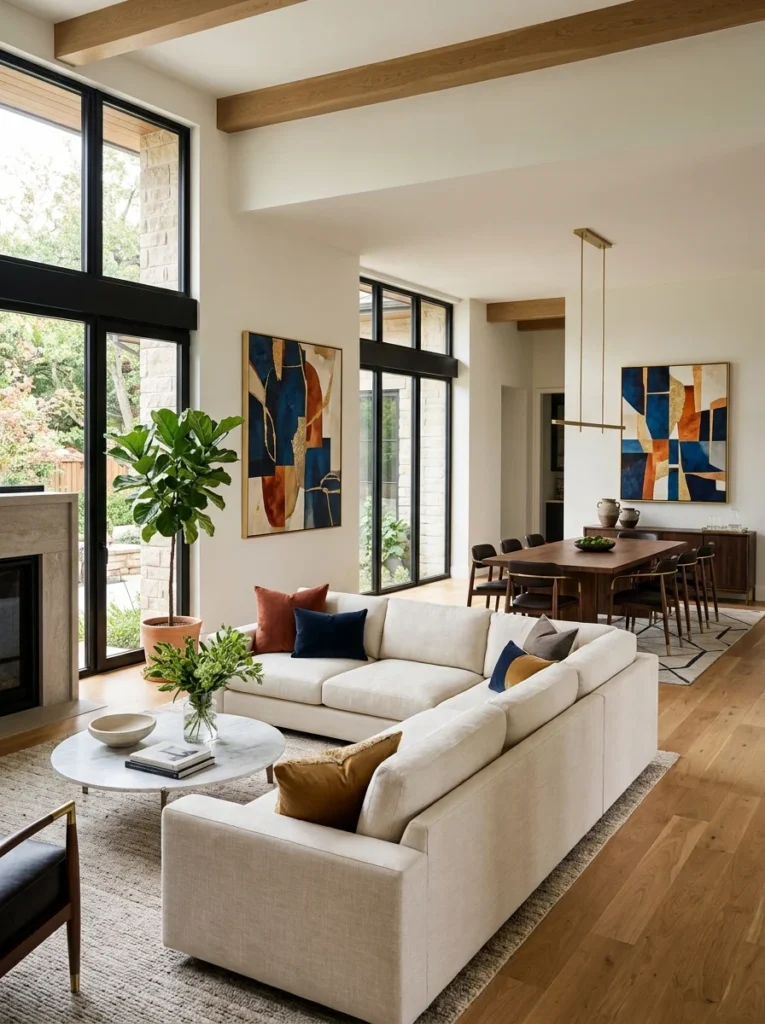
In an open-concept home, or simply between rooms that are visible from one another, like a dining room seen from an adjoining living room, some degree of color consistency in the art chosen for each space helps the overall home feel cohesive rather than like a series of disconnected color schemes bumping into each other at every doorway. This doesn’t mean every room needs an identical palette, but considering how the art in one room will look from an adjacent space, particularly for large, boldly colored pieces, avoids jarring transitions between visually connected areas.
Does wall art need to match my wall color exactly?
No, and matching too precisely can actually make art look flat and unremarkable. Art generally works best when it relates to the room’s palette through echoing an accent color, a complementary contrast, or an analogous harmony, rather than replicating the exact wall color.
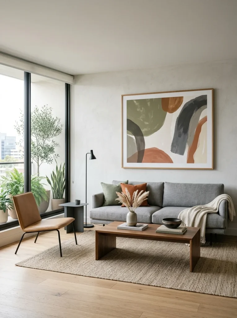
How do I choose art if I’m not sure what colors I want in a room?
Choosing your art or a key piece first, then building the room’s wall color and other elements around the colors present in that piece, is a genuinely effective approach when starting from scratch without an already-established palette to match.
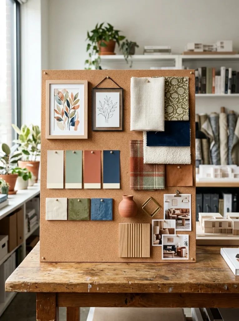
Is black-and-white art a safe choice for any room?
Generally yes, black-and-white photography or line art offers a nearly foolproof way to add visual interest without risking a color clash, and it tends to age well over time compared to boldly colored pieces tied to a specific trend or palette moment.
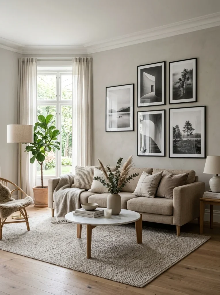
Should art match the room’s lighting temperature, not just its colors?
Yes, art with warm undertones generally suits rooms with warm lighting or ample natural light, while art with cooler undertones tends to pair better with cooler-toned or more indirect lighting, since a mismatch here can make even well-matched colors look subtly off.
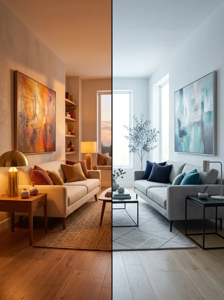
Does the frame color matter as much as the art’s colors?
Yes, the frame plays its own role in how well a piece integrates with a room, and choosing a frame color that echoes another metal or wood tone already present in the room ties the piece into the broader space more effectively than focusing purely on the art inside the frame.
Should art match between rooms that are visible from each other?
Some degree of color consistency between visually connected rooms, like an open-concept living and dining area, helps a home feel cohesive rather than disjointed, though this doesn’t mean every room needs an identical palette, just a reasonably harmonious transition between adjacent spaces.
Choosing wall art that genuinely works with your home’s palette comes down to understanding color relationships, echoing accent colors, complementary or analogous pairings, matching lighting temperature, rather than searching for an exact match to your existing walls or furniture. This approach lets art add real visual interest to a room instead of either clashing with it or disappearing into it entirely.
My once-orphaned orange and red print eventually found its true home in a warm little reading nook where its colors actually belonged, proof that even genuinely great art still needs the right room to do its job. Before your next art purchase, take a few minutes to actually study your room’s existing color structure, dominant tones, accent colors, lighting warmth, and let that understanding guide the choice rather than falling for a piece purely on its own individual merits.