A few years ago I painted my kitchen cabinets a deep charcoal-teal that a magazine had crowned the colour of the year. For about six months I loved it. Then I started noticing that every third kitchen on my feed had the exact same shade, and by the time the next “colour of the year” rolled around, mine already looked like a specific moment I could date. That’s the quiet trap with trend colours. They feel bold and current right up until they feel like last season.
Repainting cabinets is not a small job. It ate a full weekend and a fair bit of money, and I promised myself the next scheme would be one I still liked in ten years. So I did the unglamorous thing and started paying attention to which kitchens actually aged well, in real homes and in the ones I visited for work. The palettes below are the ones that keep looking right long after the trend cycle has moved on. None of them are boring. They just don’t have an expiry date printed on them.
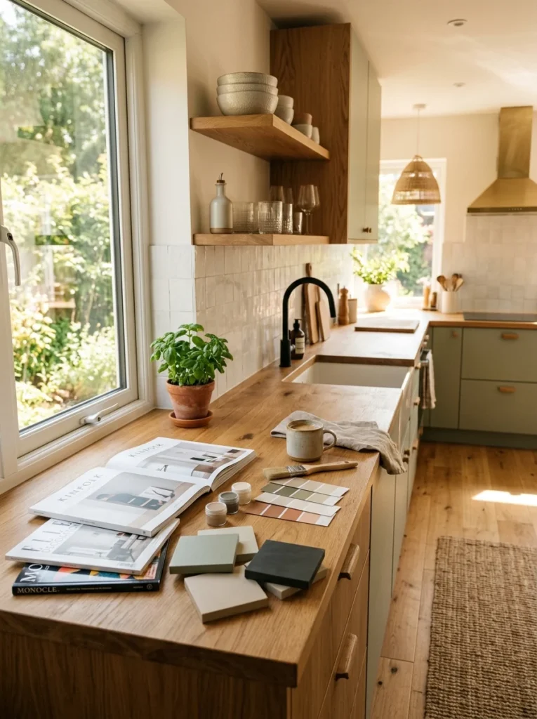
Why some colours last and others date
Before the schemes themselves, it helps to know what makes a colour timeless, because once you see the pattern you can judge any shade yourself. Colours that last tend to sit closer to nature: the tones of stone, wood, clay, sand, water and foliage. Our eyes have looked at those forever, so they don’t tire of them. The colours that date fastest are usually the ones tied to a specific manufactured trend, a very saturated or unusual mix that felt novel precisely because nothing in nature looks quite like it. Novelty is exciting and short-lived by definition.
The other factor is where you put the colour. I’ve learned to keep bold or trend-driven colour on the things that are cheap and quick to change, like a wall of paint, a blind, bar stools or tea towels. The expensive, hard-to-change surfaces, the cabinets, the worktop, the flooring, I keep in colours I’m confident I’ll live with for years. Get that division right and you can chase trends all you like without repainting your whole kitchen every time one shifts.

Eight colour schemes that keep their looks
1. Warm white and natural wood
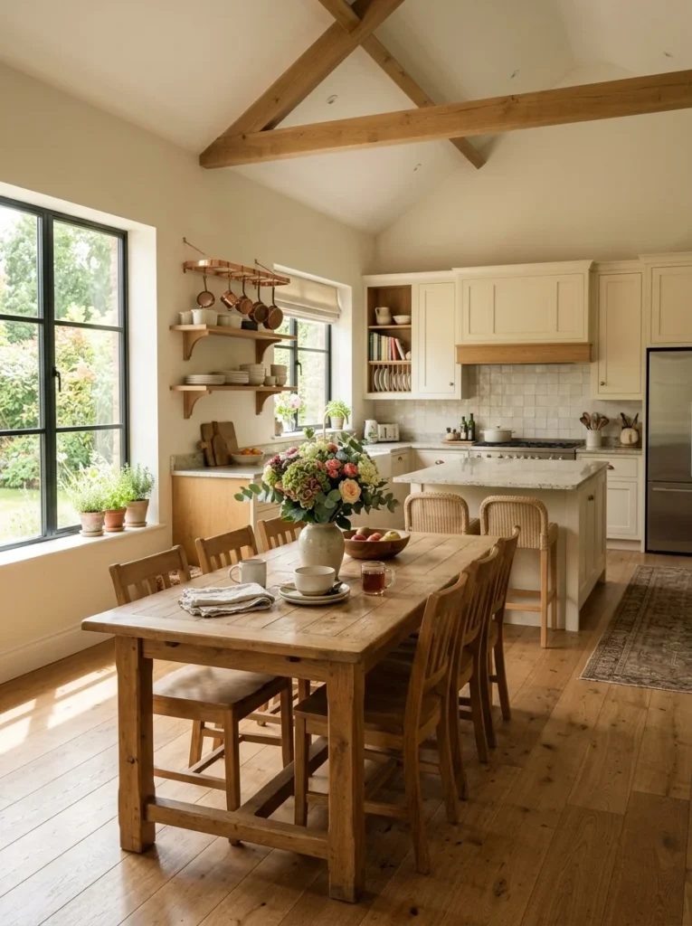
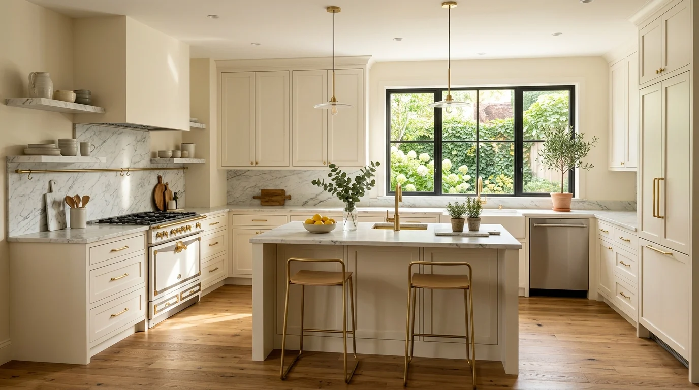
This is the one I eventually landed on, and I’ve never regretted it. Warm white cabinets, not the cold blue-white that can feel clinical, paired with warm wood on the floor, a shelf or a butcher-block section of counter. It is the safest timeless scheme there is, and it earns that reputation. The white keeps a small kitchen feeling open and bounces light around, while the wood stops it feeling sterile and adds the warmth that pure white lacks. The one thing to watch is undertone. Test your white against the wood in your actual kitchen light, because a white with a yellow undertone next to an orange-toned wood can start to look muddy. When the tones agree, the room feels calm in a way that never seems to age.
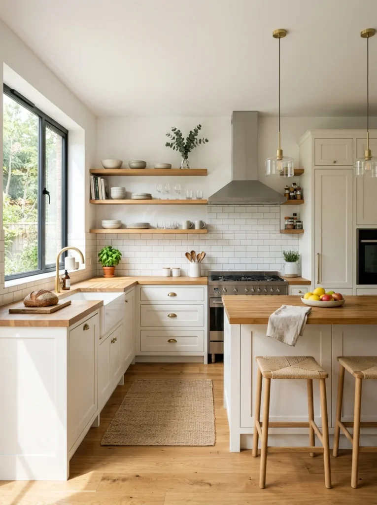
2. Soft sage green and cream
Green cabinets could sound like a risk, but muted, greyed-down greens like sage have quietly become a modern classic rather than a trend, because they read as a natural, botanical colour rather than a loud one. I have soft sage on my lower cabinets now and cream above, and two years on it still feels fresh. Sage flatters wood, brass and off-white beautifully, and it’s forgiving in a way brighter greens are not. Keep the walls and uppers in a warm cream or off-white so the green stays the accent and doesn’t swallow a small room. This is a palette that looks equally at home in a cottage and a clean modern flat, which is usually a sign a colour has staying power.
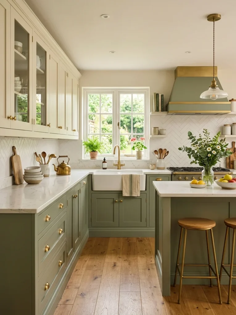
3. Navy blue and white with brass
Navy sits in the same family as classic denim: it has been around long enough to prove it isn’t going anywhere. Deep navy lowers with white uppers and worktops give you contrast and a sense of grounding without the starkness of black. Add brass or aged-gold handles and taps and the whole thing lifts into something that feels considered rather than trendy. I used a version of this in a friend’s kitchen we redid together, and what struck me was how much the navy hid daily marks and scuffs compared to the paler cabinets I’d had before. It’s a practical colour dressed up as an elegant one.
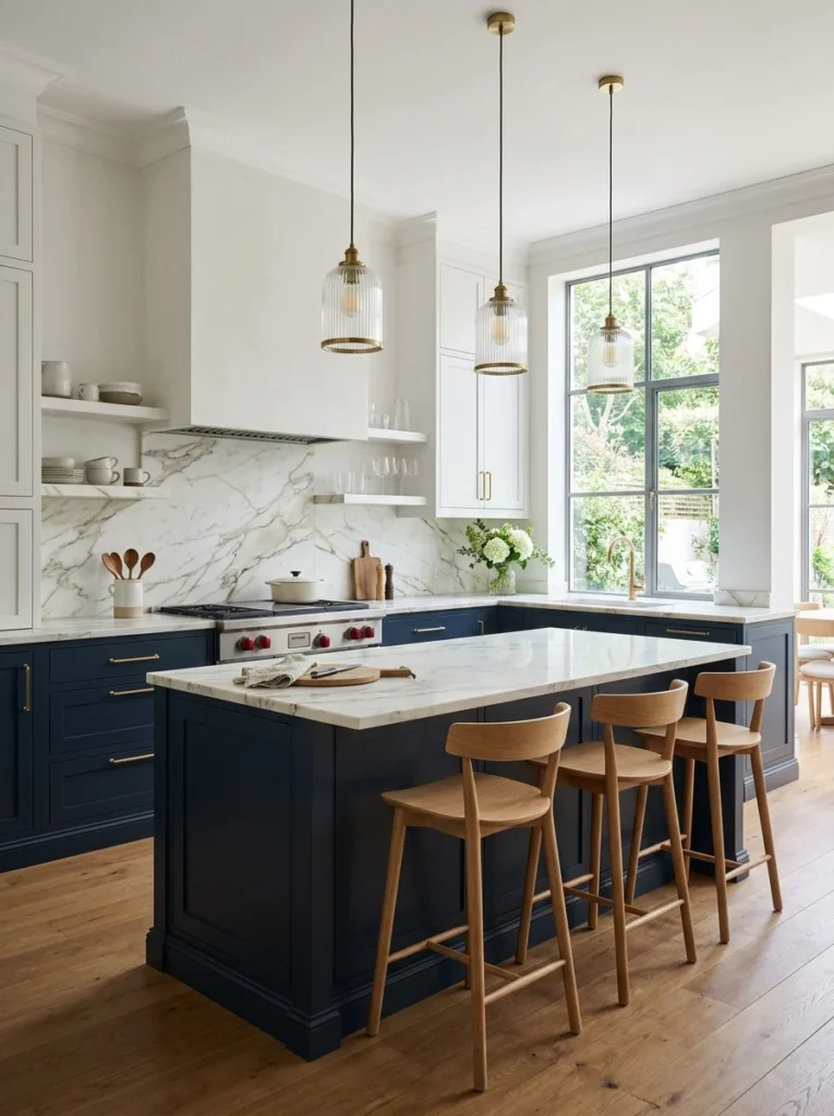
4. Two-tone: darker base, lighter top
Putting a deeper colour on the base cabinets and a lighter one on the uppers is a formula that flatters almost any room, and it’s genuinely timeless because it mirrors how we naturally read a space, heavier at the bottom, lighter at the top, like a landscape with ground and sky. In a small or low-ceilinged kitchen this trick also makes the ceiling feel higher. You can swing this classic (charcoal below, white above) or soft (taupe below, cream above). Whatever you choose, keeping the two tones in the same broad family rather than picking two loud contrasting colours is what keeps it looking intentional years down the line.
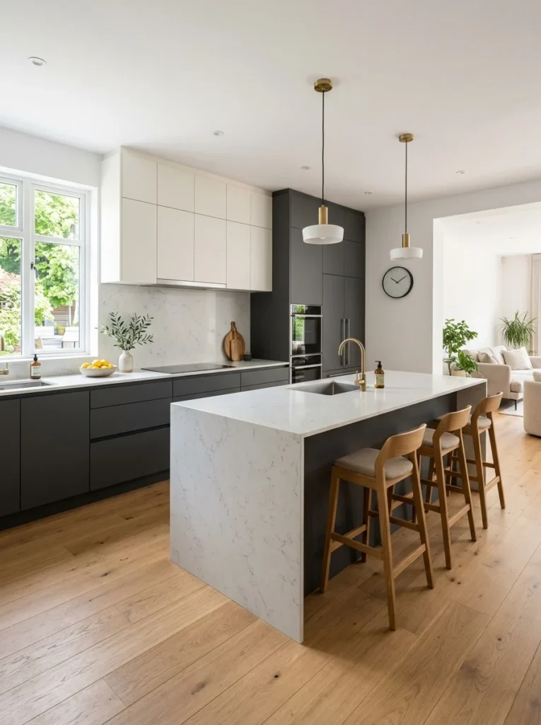
5. Greige and monochrome warmth
Greige, the marriage of grey and beige, gets mocked for being a landlord special, but done with care it is one of the most durable palettes going. The trick is warmth. Cold, flat grey kitchens are exactly the ones that already look dated, because that particular cool grey was itself a trend that peaked and passed. A warm greige with beige and taupe in its bones does the opposite. Layering a few close tones of it, slightly different shades on cabinets, walls and stone, gives you a soft, restful room that photographs beautifully and never shouts. I steer people toward warm neutrals over cool ones almost every time now, purely because of how much better they age.
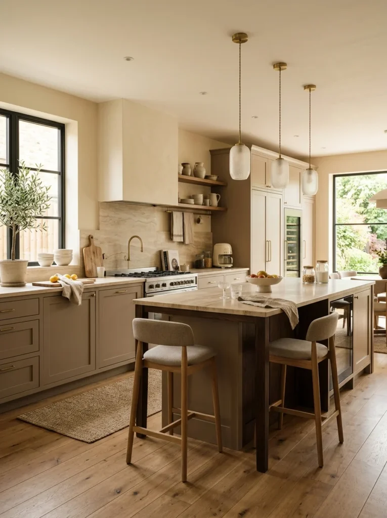
6. Classic black and white
Black and white is about as timeless as a colour scheme gets. It has been in kitchens for a century and it still looks sharp. The reason it never dates is that it isn’t really a colour choice at all, it’s a contrast choice, and contrast doesn’t go out of fashion. In a small kitchen I’d let white dominate and use black as the accent, on the hardware, the taps, a single band of lower cabinets or the window frames, rather than drenching the room in it. A little black gives a kitchen definition and a slightly graphic, modern edge, while the white keeps it from feeling heavy. Add one warm element, wood or a woven basket or a plant, so the pairing reads crisp rather than cold.
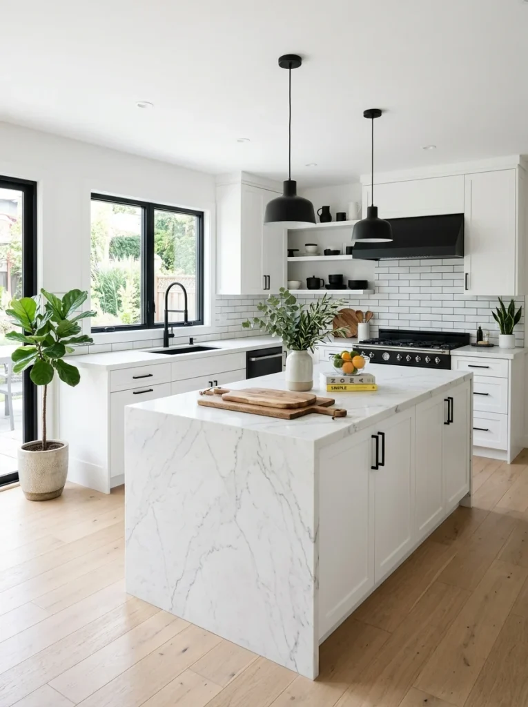
7. Cream and terracotta earth tones
Warm earthy palettes, cream and off-white lifted with terracotta, clay, rust or soft ochre, tap into colours that have decorated homes for thousands of years, which is roughly the opposite of trendy. This scheme brings genuine warmth and works especially well if you get a lot of natural light, because the sun makes the earthy tones glow. I usually keep the cabinets and walls in the cream range and bring the terracotta in through tile, a clay pot, ceramics or textiles, so the warm colour is easy to adjust over time. It’s a palette that feels welcoming and lived-in rather than showroom-perfect, which is exactly why it doesn’t age like a showroom does.
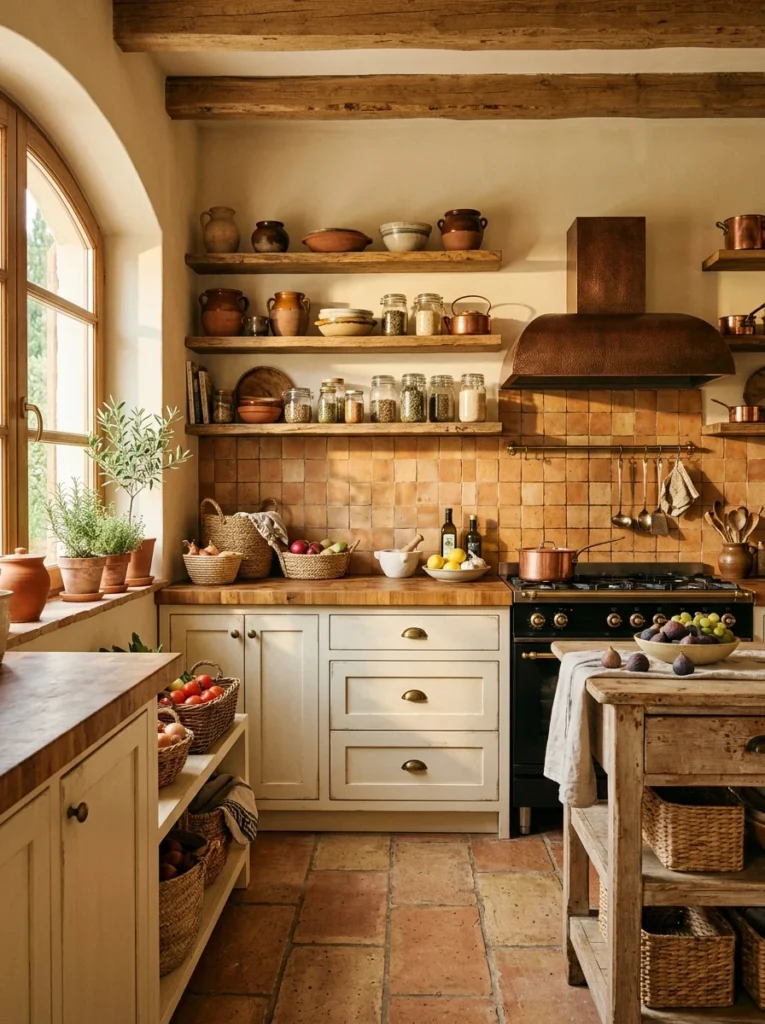
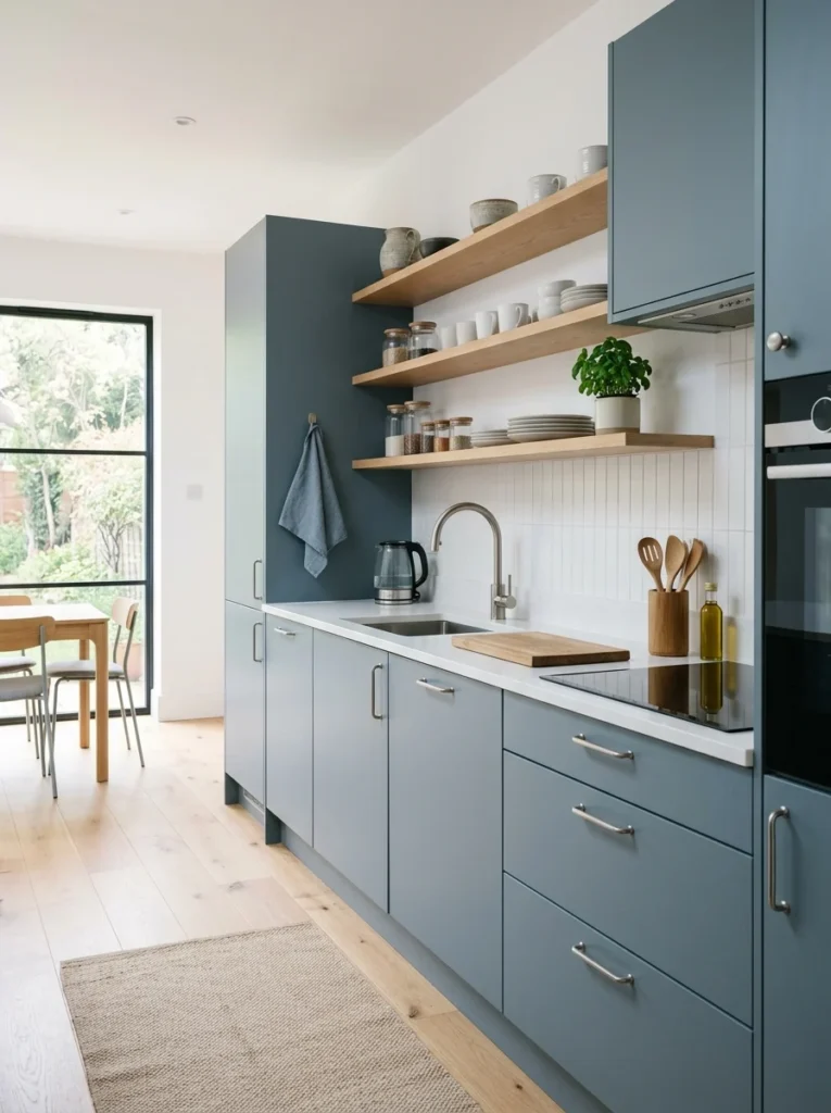
8. Muted blue-grey and pale wood
A soft, chalky blue-grey on cabinets, the kind of colour you might see on old painted furniture, paired with pale wood and white walls, is quietly one of the most enduring modern palettes. It has the calm of a neutral but a little more character, and because the blue is heavily muted it never tips into a loud statement that could date. This one suits a kitchen you want to feel serene and slightly Scandinavian. Keep the wood light and the metals simple, brushed steel or soft nickel rather than heavy gold, and the whole room settles into an easy, timeless quiet.
How to build a scheme that lasts, step by step
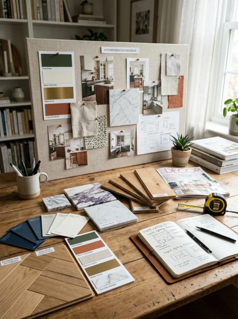
Picking individual colours you like is easy. Making them work together is where kitchens go wrong. A simple rule that has saved me every time is the 60-30-10 balance: roughly 60 percent of the room in a main colour (usually the cabinets or walls), 30 percent in a secondary colour (the other of those two, or the worktop), and 10 percent in an accent (hardware, a stool, textiles). When a kitchen feels chaotic, it’s often because those proportions are off and three or four colours are all fighting to lead.
The second thing I never skip now is undertones. Every neutral leans somewhere, warm or cool, and mixing a cool-toned white with a warm-toned cream makes both look slightly wrong without most people being able to say why. Hold your samples side by side in daylight and you’ll start to see it. And please, test large paint swatches on the actual wall and look at them at different times of day. Kitchen light changes everything. A colour that looks like soft sage at 10am can read grey and dull under warm evening bulbs. I’ve been fooled by this more than once, which is exactly how I ended up repainting.
The mistakes that taught me all this
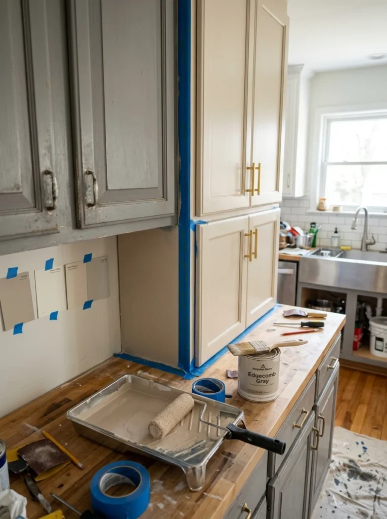
The charcoal-teal cabinets were lesson one. Lesson two was choosing a very fashionable cool grey for a rental kitchen because everyone was doing it, only to watch that exact grey become the thing people started calling dated barely two years later. Cool greys taught me to lean warm. Lesson three was subtler: I once picked a gorgeous worktop first and built the cabinet colour around it, then found the worktop was the trend-driven element and the part that dated fastest. Now I anchor a scheme with the most permanent, hardest-to-replace surface in the most timeless colour, and let the cheaper, easier-to-swap pieces carry any personality or trend I want to play with.
If there’s one habit worth stealing from all my repainting, it’s this: before you commit, imagine the kitchen with the trend stripped out. Picture it without the currently fashionable accent colour, without the of-the-moment finish. If the bones, the cabinets, worktop and floor, still look good to you plain, you’ve got a scheme that will last. If the whole thing only works because of the trendy bits, it’ll date the moment those bits do.
Questions I get about kitchen colours
What is the safest timeless kitchen colour?
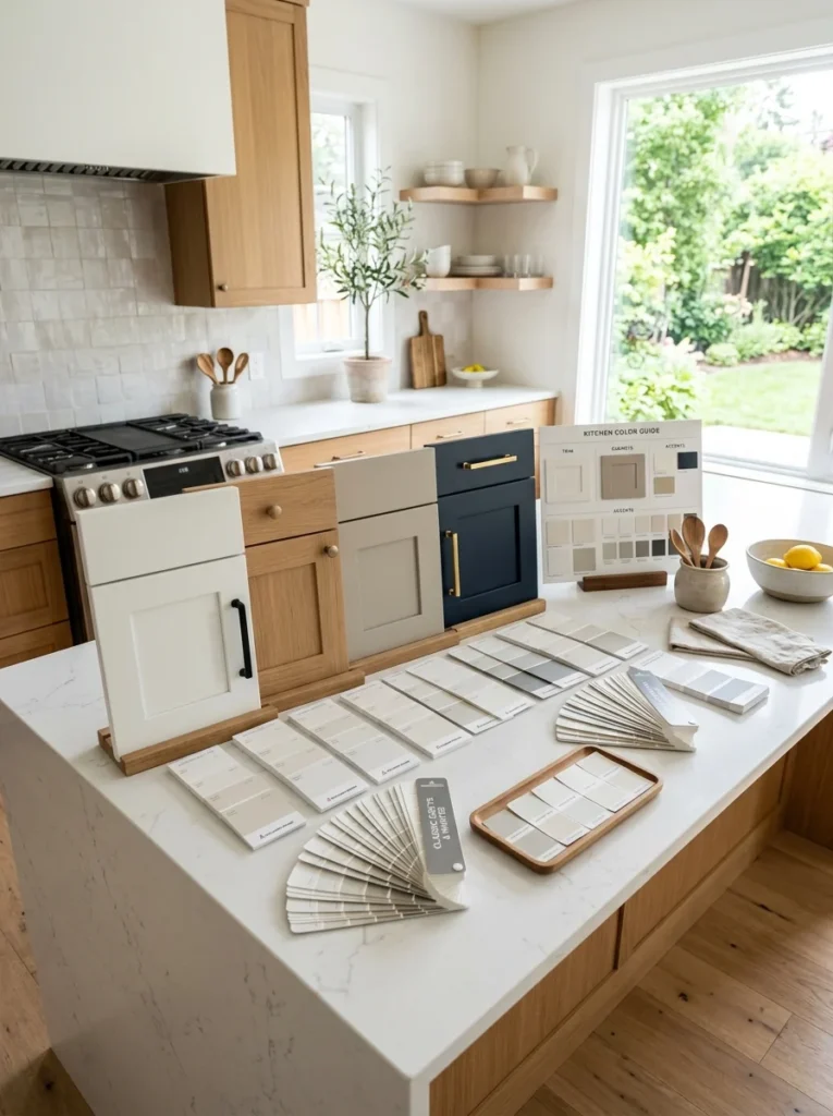
Warm white cabinets paired with natural wood is the safest choice, because it’s bright, flexible, and never tied to a particular era. If plain white feels too safe for you, a muted sage green or a soft warm greige are the next most durable options.
Are grey kitchens out of style?
Cool, flat greys are the ones now starting to look dated, because that specific cool grey was itself a trend. Warm greys and greige, with beige and taupe in them, still age well. If you love grey, go warm rather than cool and you’ll be far happier in a few years.
Should I match my walls to my cabinets?
Not exactly match, but keep them in the same undertone family. A common timeless approach is cabinets in your main colour and walls in a lighter shade of a compatible neutral, so they relate without being identical. Use the 60-30-10 balance to keep the proportions calm.
How do I add trendy colour without it dating my kitchen?
Put the trend on the things that are cheap and quick to change: paint on the walls, bar stools, blinds, ceramics, tea towels, small appliances. Keep the expensive permanent surfaces, cabinets, worktop and floor, in colours you’re confident you’ll still like in ten years.
Choose for the long haul, not the feed
The kitchen I repainted taught me an expensive lesson that I’m happy to hand over for free: colour that looks striking in a photograph and colour that feels right to live inside for years are not always the same thing. The palettes that last aren’t the loudest ones. They’re the ones that borrow from nature, sit in warm rather than cold tones, and keep their boldest choices on the parts you can change in an afternoon. Pick your permanent colours for the long haul, let the easy pieces carry the trends, and you’ll have a kitchen that still looks right long after this year’s colour of the year has been quietly forgotten.
If you’re standing in your kitchen right now trying to decide, tape up a few big swatches and give them a couple of days before you commit. That short wait has saved me a full repaint more than once, and it might just do the same for you.