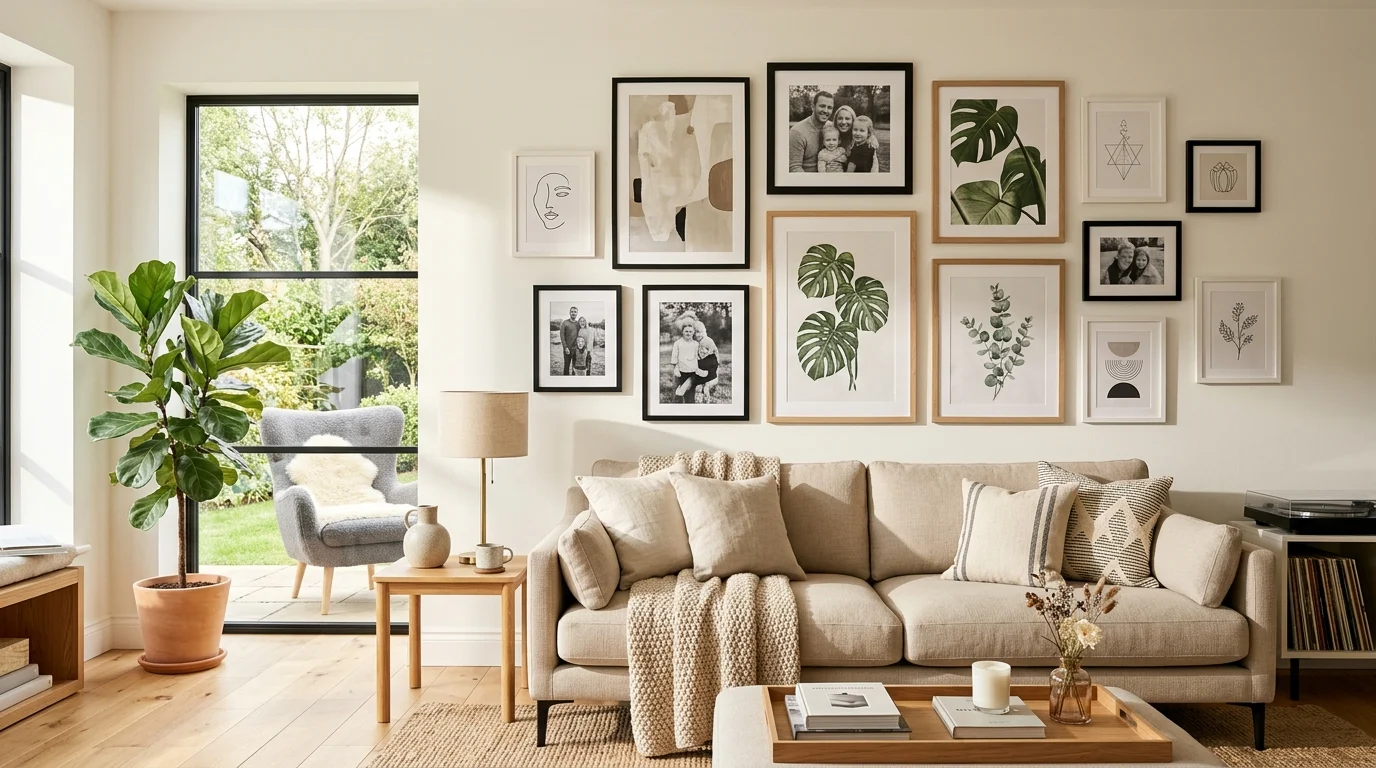
My first attempt at a gallery wall involved hanging frames the moment I unwrapped them, spacing decided purely by whatever felt right in the moment, and the result looked less like a curated collection and more like a wall where things had simply accumulated over time without any real plan. It wasn’t until I started over, laying everything out on the floor first and actually planning the arrangement before a single nail went into the wall, that the same collection of frames I already owned suddenly looked intentional and cohesive instead of random. The frames never changed; only the planning behind their arrangement did.
A gallery wall can transform a blank stretch of wall into one of the most personal, visually rich features in a room, but it does require more planning than hanging a single piece of art. Here’s how to approach it as a genuine beginner, from initial planning through the final hanging.
Choose a unifying element before selecting individual pieces
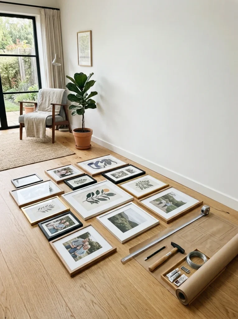
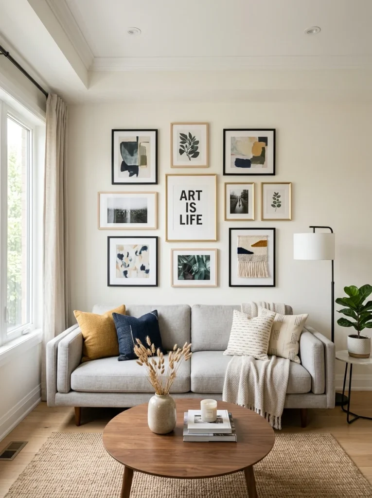
A collection of completely unrelated frames, art styles, and sizes can look chaotic rather than curated unless there’s some unifying thread tying the whole arrangement together. This could be a consistent frame color across every piece, a shared color palette within the art itself, a common theme like family photos or travel prints, or simply a consistent mix of black-and-white and color images. Deciding on this unifying element first gives every subsequent choice, which frames to buy, which art to include, a clear guiding principle rather than assembling pieces purely as they catch your eye.
Lay out the arrangement on the floor first
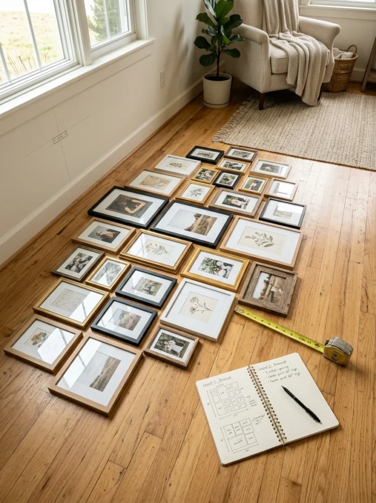
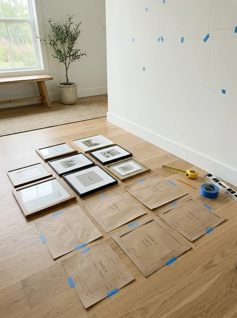
Before hanging anything, lay out your full collection of frames on the floor in the approximate arrangement you’re considering, adjusting spacing and positioning until it feels balanced. This step, which I skipped entirely in my own first failed attempt, lets you experiment freely without any commitment, since moving frames around on the floor costs nothing compared to patching and repainting a wall full of misplaced nail holes. Take a photo of your final floor layout before moving to the wall, so you have a clear reference to work from during the actual hanging process.
Use paper templates to plan exact wall placement
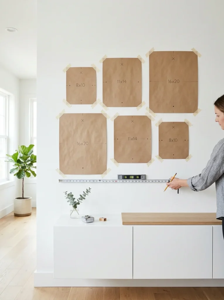
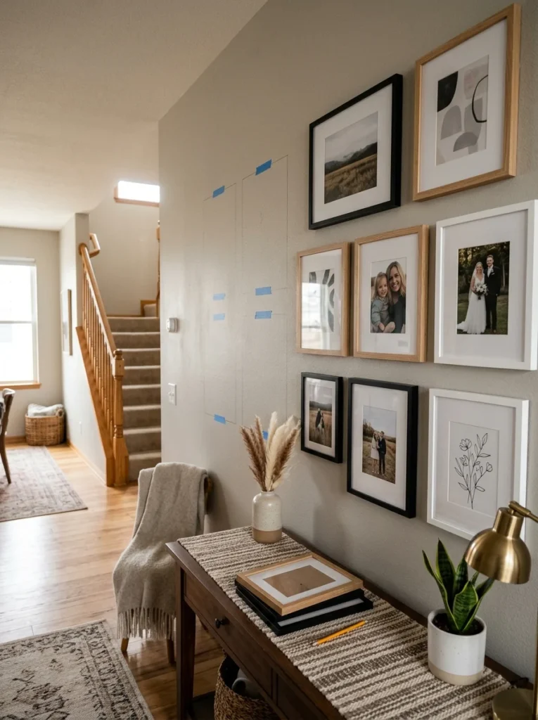
Once you’re happy with the floor arrangement, trace each frame onto craft paper and cut out the shapes, then tape these paper templates directly onto the wall in your planned arrangement. This lets you fine-tune spacing and alignment directly on the actual wall, adjust for the room’s specific lighting and sightlines, and mark exact nail placement through the paper before ever picking up a hammer, eliminating the guesswork and unnecessary extra holes that come from hanging frames directly and then realizing the spacing isn’t quite right.
Establish a consistent spacing rule throughout the arrangement
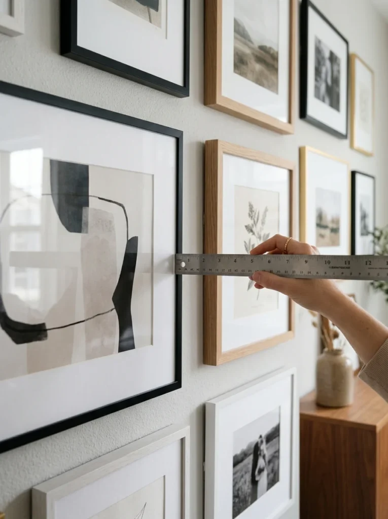
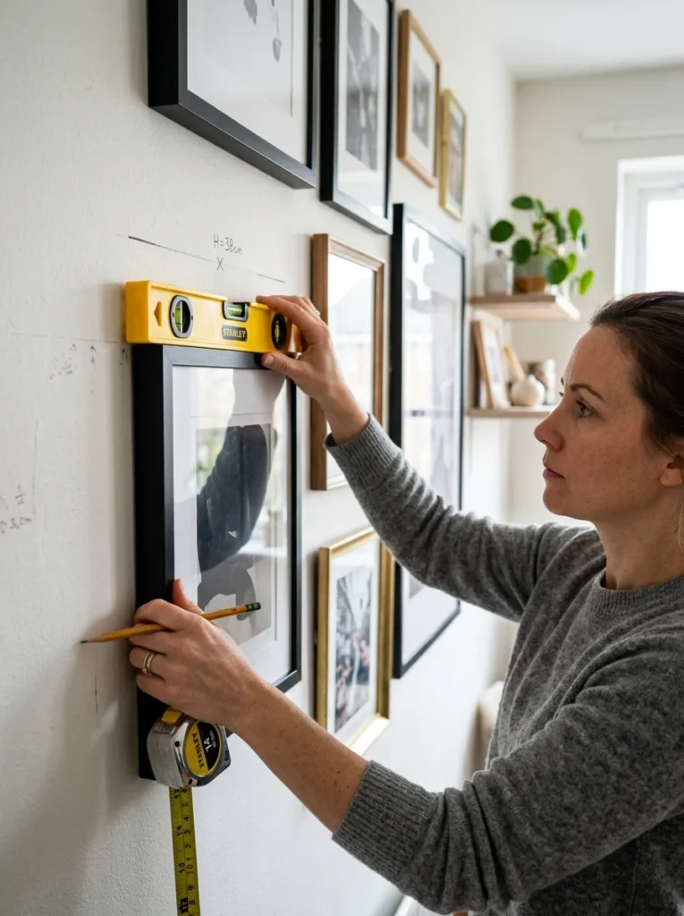
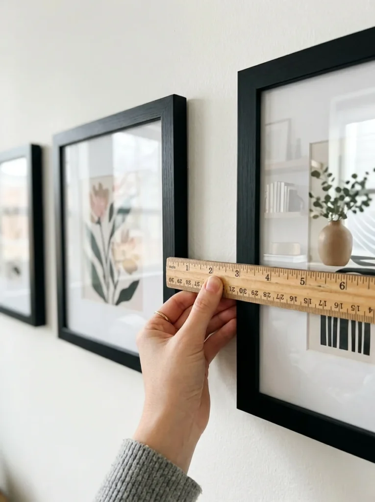
A gallery wall generally looks more intentional with consistent spacing between frames, typically two to three inches, maintained throughout the arrangement, rather than varying gaps that can read as careless rather than deliberately eclectic. Measuring and maintaining this consistent gap, even while varying frame sizes and orientations within the arrangement, gives the overall composition a sense of order that ties an otherwise varied collection together.
Anchor the arrangement around a focal point
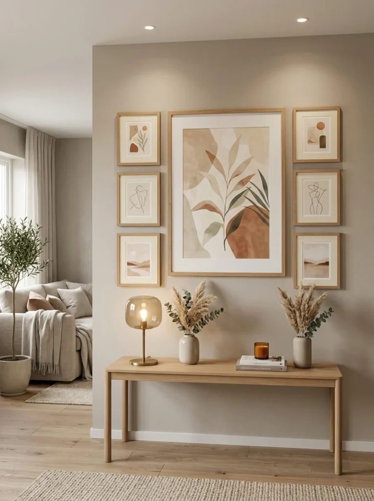
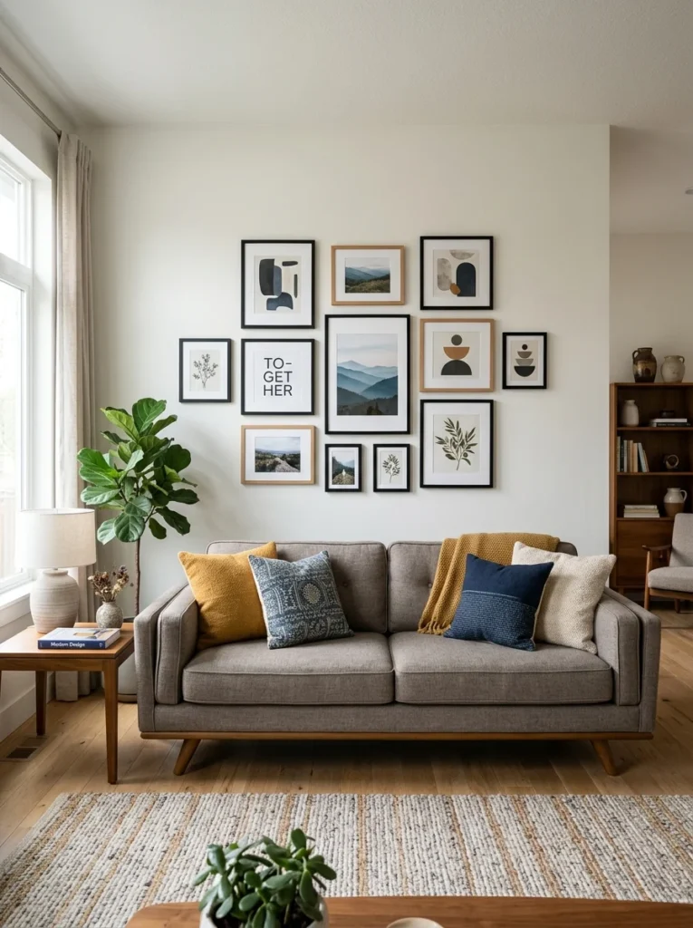
Choosing one larger or more visually significant piece as the anchor of the arrangement, then building the rest of the collection around it, gives the eye a clear starting point and prevents the arrangement from feeling like a random scatter of equally weighted pieces. This anchor piece doesn’t need to be centered exactly in the middle of the arrangement, but it should generally sit at or near eye level, since that’s the natural focal height most people’s eyes gravitate toward first when looking at a wall.
Consider a grid layout for a more formal, structured look
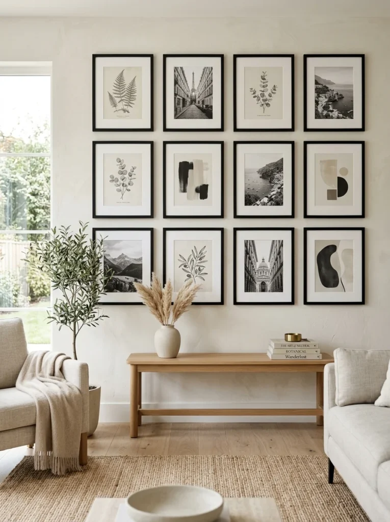
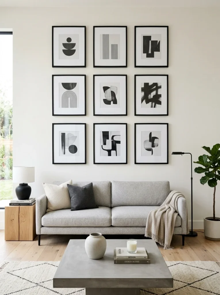
If your style leans more toward clean, symmetrical design rather than an eclectic mix, a grid arrangement, uniform frame sizes arranged in even rows and columns with consistent spacing, delivers a more formal, structured gallery wall look. This approach works particularly well for a cohesive series, matching botanical prints, a set of family portraits in identical frames, or any collection where visual consistency across every piece is part of the intended design rather than a deliberately varied, eclectic mix.
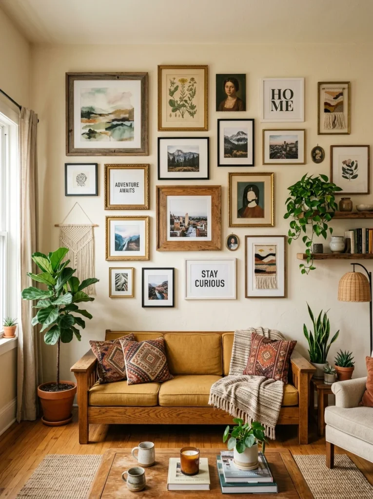
Choose an organic, salon-style layout for a more eclectic feel
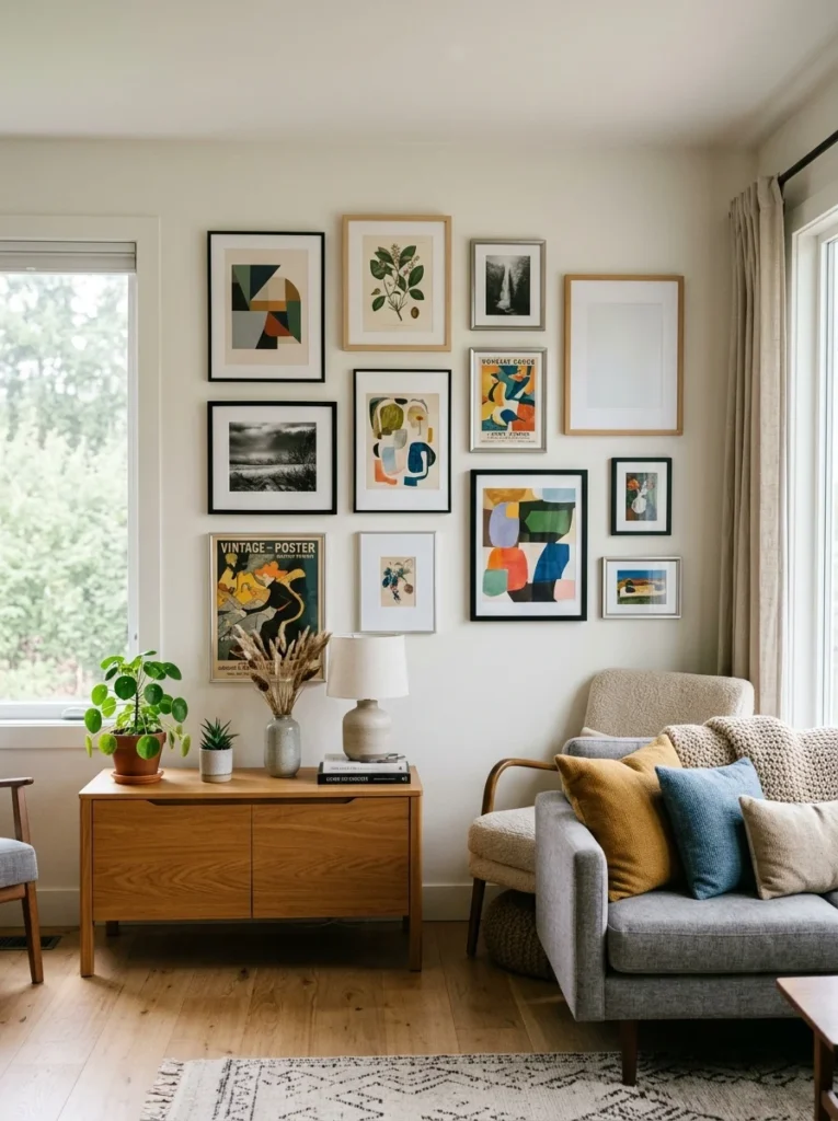
An organic or salon-style arrangement, mixing frame sizes, orientations, and sometimes even frame colors within a single loosely bounded shape, creates a more collected-over-time, eclectic feeling than a strict grid. This style benefits even more from the floor-layout and paper-template planning steps described above, since the lack of a strict grid structure means spacing and balance require more careful visual judgment to avoid looking genuinely disorganized rather than intentionally eclectic.
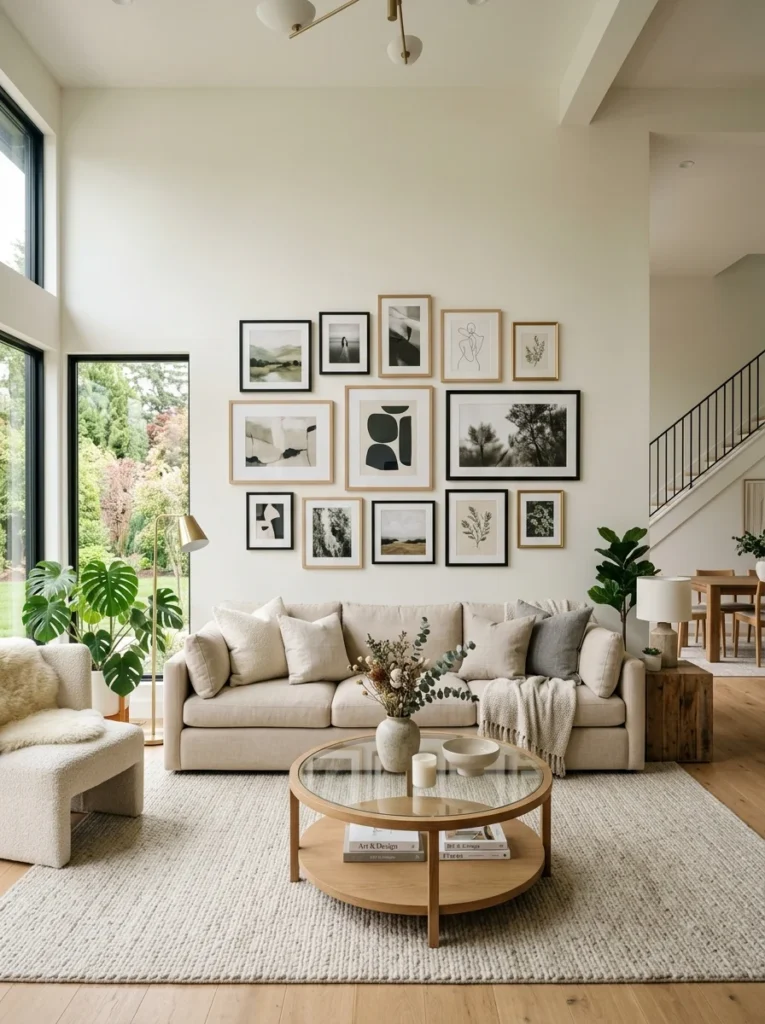
Account for the wall’s overall proportions
A gallery wall arrangement should generally relate proportionally to the wall it’s on and any furniture beneath it, similar to how a single piece of art or mirror should relate to the furniture below it. An arrangement that’s too small for a large, tall wall can look lost and insignificant, while one that’s too large for the available wall space can feel cramped and overwhelming. Measuring the wall and any furniture beneath it before finalizing your arrangement’s overall size helps avoid either of these proportion mismatches.
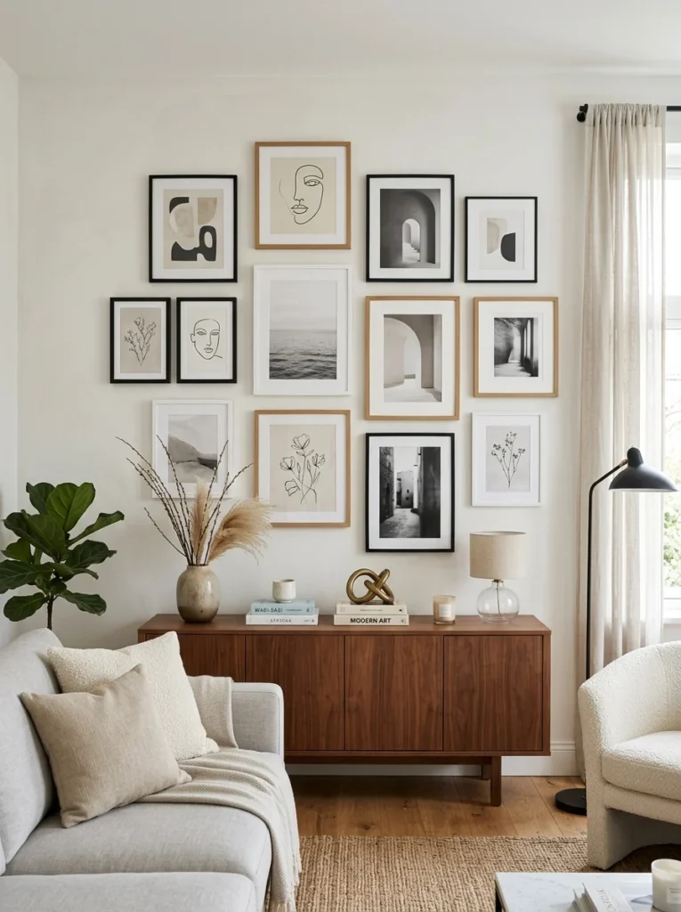
Mix frame styles thoughtfully rather than randomly
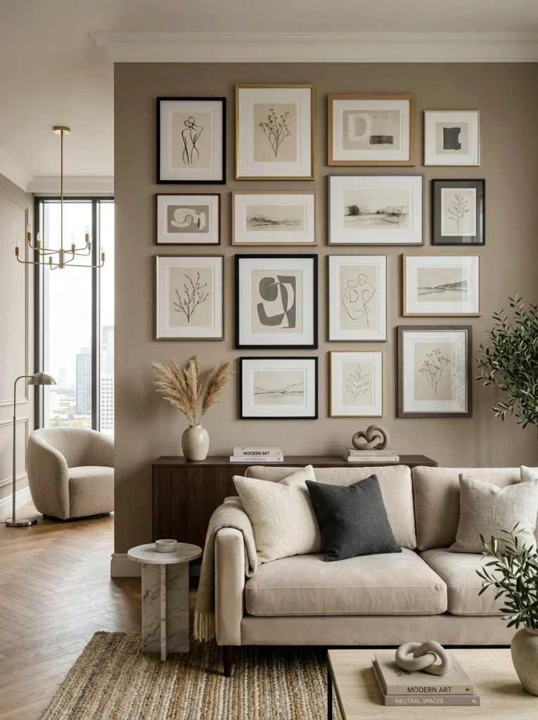
Combining different frame styles, wood, metal, ornate, simple, within one gallery wall can add visual interest, but doing this successfully usually requires some connecting thread, a consistent color family across the different frame finishes, or a consistent mat board color throughout, even as the frames themselves vary. Mixing frames with zero connecting thread at all, different colors, different styles, different finishes, often reads as mismatched rather than intentionally eclectic, undermining the curated feeling a gallery wall is meant to achieve.
Leave room to add to the collection over time
A gallery wall doesn’t need to be entirely finished and complete on day one. Planning the initial layout with a bit of extra wall space, or a loosely structured arrangement that can accommodate an additional piece or two later, lets the collection genuinely grow and evolve over time, adding a new travel photo, a piece of art from a recent trip, without needing to completely redesign the entire arrangement from scratch every time you want to add something new.
Hang the arrangement at the right overall height
A common mistake with gallery walls, and single pieces of art generally, is hanging them too high, well above natural eye level, which can make an otherwise well-planned arrangement feel disconnected from the room. As a general guideline, the center of a gallery wall arrangement should sit at roughly eye level for an average adult standing in the room, which is typically somewhere around fifty-seven to sixty inches from the floor to the center of the whole grouping. Above a piece of furniture like a sofa or console, the arrangement’s lowest edge should also maintain a reasonable gap above that furniture, generally around six to eight inches, so the grouping doesn’t feel like it’s crowding or sitting directly on top of the furniture below it.
Choose appropriate hanging hardware for each frame’s weight
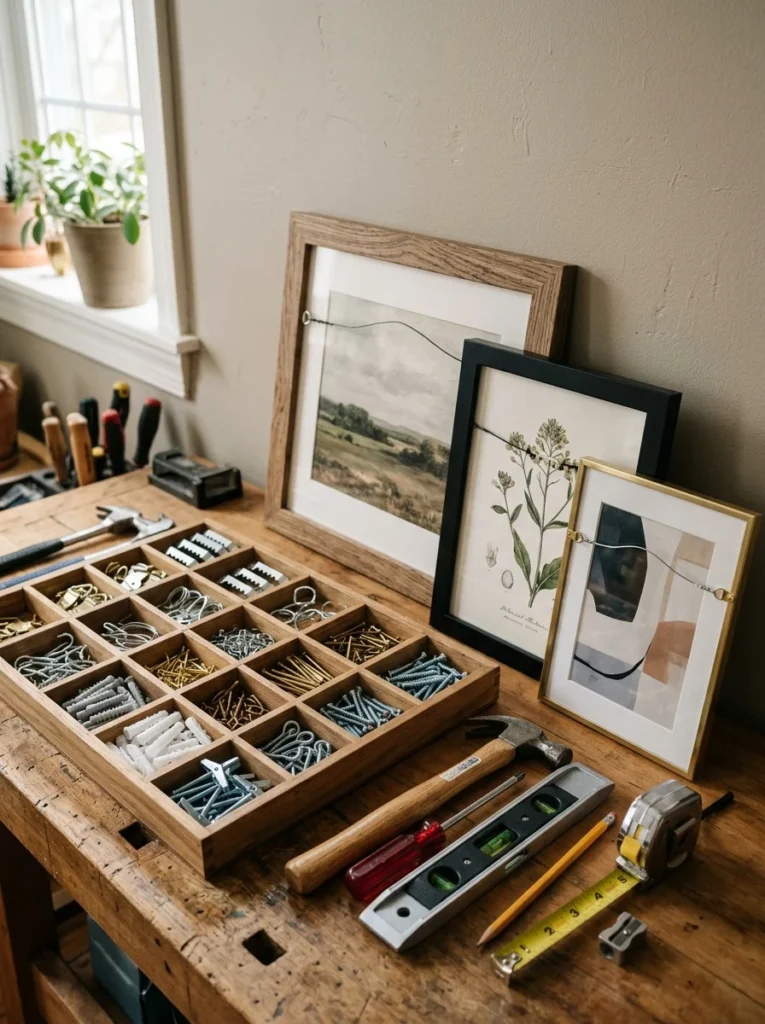
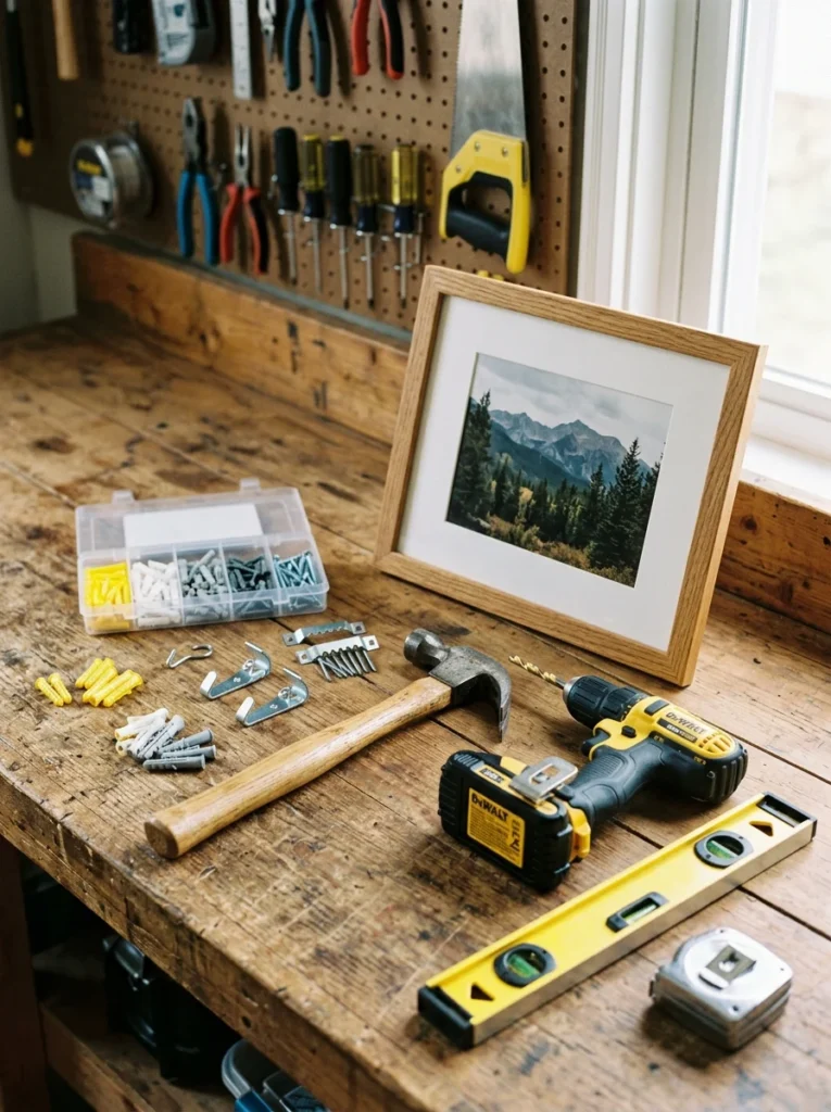
Different frame weights require different hanging hardware, and using the wrong type is one of the more common reasons a gallery wall frame ends up crooked, loose, or, in worse cases, falling off the wall entirely. Lightweight frames can typically be hung with simple picture hooks rated for their approximate weight, while heavier frames, larger mirrors, or anything with glass benefit from a proper wall anchor or, ideally, hanging directly into a wall stud when possible. Checking the weight rating on picture hooks and matching it appropriately to each specific frame, rather than assuming one hook size works for the entire arrangement, protects both the art and the wall itself from unnecessary damage over time.
Use a level and consistent reference points during installation
Even with careful planning on paper, a small level is essential during the actual hanging process to ensure each frame sits straight, since even a slightly crooked frame becomes noticeably more obvious within a larger, more visually busy gallery wall arrangement than it would as a single standalone piece. Working from your paper template’s marked measurements, rather than eyeballing each subsequent frame’s position relative to the ones already hung, helps maintain the consistent spacing and alignment planned during the earlier floor and template stages, rather than allowing small errors to compound as you move across the full arrangement.
How much spacing should I leave between frames on a gallery wall?
Two to three inches of consistent spacing between frames generally works well for most arrangements, giving the collection a sense of order even when frame sizes and orientations vary considerably within the overall layout.
Should I plan my gallery wall layout before hanging anything?
Yes, laying out the full arrangement on the floor first, then using paper templates taped to the wall to fine-tune exact placement, prevents unnecessary nail holes and lets you adjust spacing and balance before any commitment to the actual wall.
Do all the frames in a gallery wall need to match?
No, but successfully mixing different frame styles and finishes generally requires some unifying element, a shared color family, a consistent mat board, or a common theme within the art itself, to keep the arrangement feeling curated rather than randomly assembled.
Can I add to my gallery wall after the initial arrangement is finished?
Yes, planning some extra space or a loosely structured layout from the start allows the collection to grow naturally over time, without requiring a complete redesign each time you want to incorporate a new piece.
How high should I hang a gallery wall?
As a general guideline, the center of the entire arrangement should sit at roughly eye level, typically around fifty-seven to sixty inches from the floor, and if it’s above furniture, the lowest frames should maintain about six to eight inches of clearance above that piece.
What hanging hardware should I use for a gallery wall?
Lightweight frames generally work fine with picture hooks rated for their approximate weight, while heavier frames or mirrors benefit from a proper wall anchor or hanging directly into a wall stud, which provides more secure support than a basic hook alone.
A successful gallery wall comes down to genuine planning before any hanging begins: choosing a unifying element, laying out the arrangement on the floor, using paper templates for exact wall placement, and maintaining consistent spacing throughout. None of this requires special design training, just a willingness to plan before committing to the wall.
My own gallery wall, once a genuinely random collection of frames hung with no forethought, now looks intentional and cohesive using the exact same pieces I already owned, simply arranged with an actual plan behind them. If you’re starting your own gallery wall, resist the urge to hang the first frame the moment you unwrap it; lay everything out on the floor first, and let that planning step do most of the real design work before a single nail goes into the wall.