
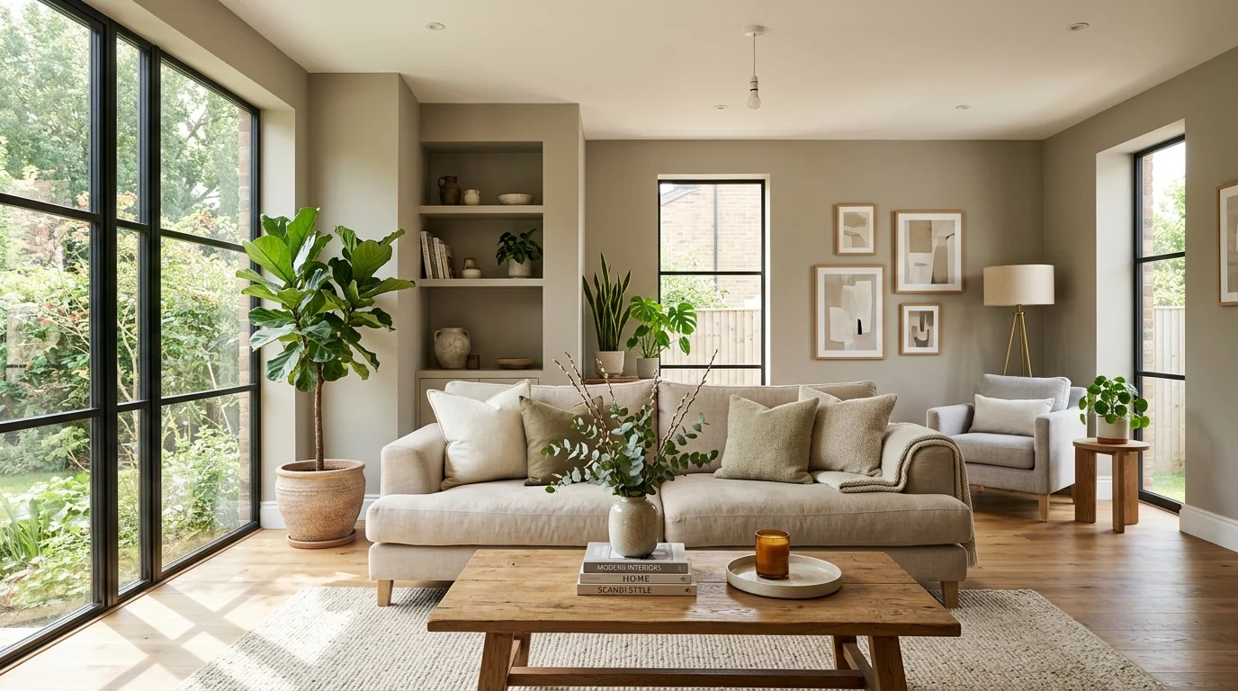
I picked my first living room paint color entirely from a tiny swatch held under the bright fluorescent lights of the hardware store, and by the time it dried on our actual walls at home, it had shifted from a soft, warm greige into something that looked disturbingly close to pale pink under our living room’s afternoon light. I ended up repainting within a few months, and that expensive lesson taught me that a paint color’s appearance depends enormously on the specific lighting it lives in, not just how it looks on a small chip under a store’s generic lighting.
Choosing a living room paint color that actually works well across your specific room’s changing light throughout the day requires a bit more care than picking whatever looks appealing on a small sample at the store. Here’s how to actually get it right the first time.
Understand how natural light direction affects color
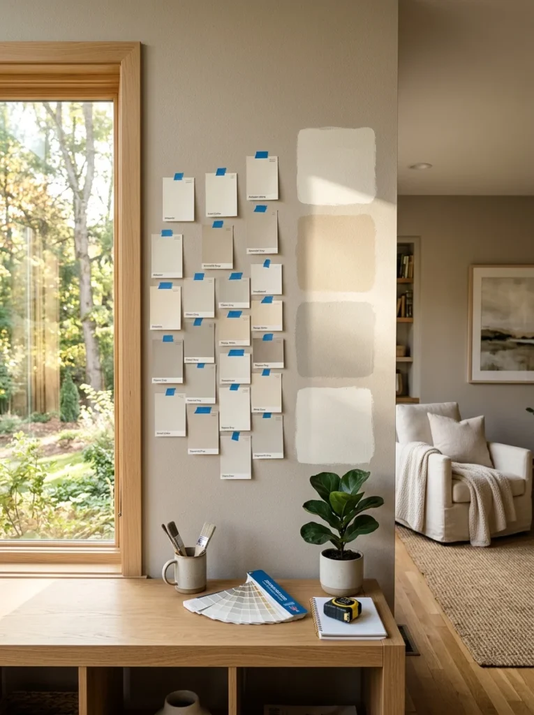
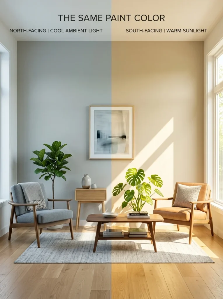
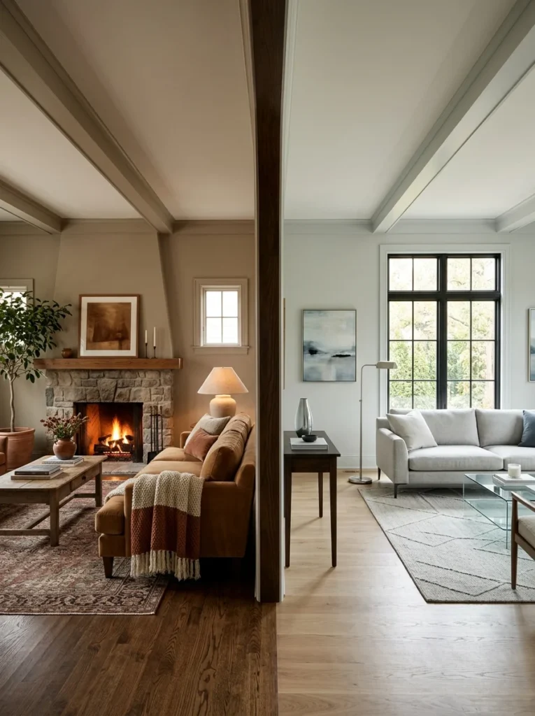
The direction your living room windows face has a significant, predictable effect on how paint colors read throughout the day. North-facing rooms receive cooler, bluer, more consistent light throughout the day, which can make colors appear slightly cooler and sometimes flatter than they do in a paint store. South-facing rooms receive warm, strong light for much of the day, which tends to make colors appear warmer and more saturated than expected. East-facing rooms get bright, warm light in the morning that shifts cooler as the day progresses, while west-facing rooms see the reverse, cooler light earlier shifting to warm, golden light in the evening. Knowing your room’s specific orientation helps you anticipate how a color is likely to shift throughout the day before you ever open a can of paint.
Always test large samples directly on your own walls
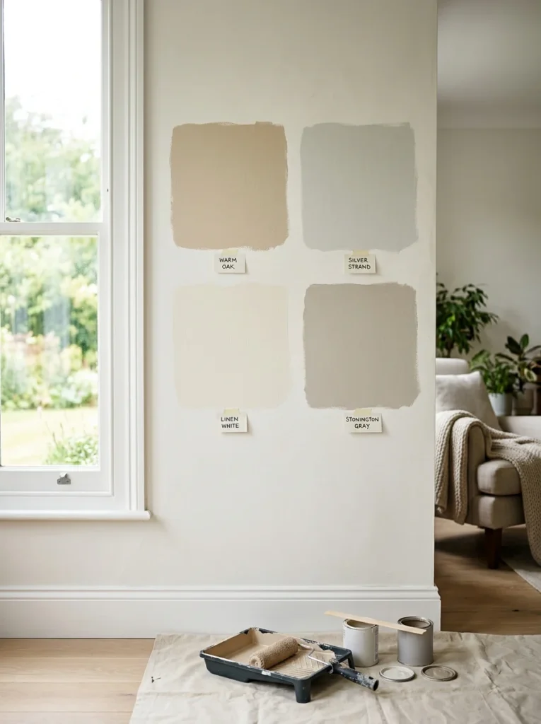
A small paint chip, however accurate it might seem in the store, simply can’t show you how a color will actually look across a large wall surface in your specific room’s lighting. Painting a large sample swatch, at least a two-foot by two-foot section, directly on the wall itself, rather than on a separate poster board that can be moved around, lets you see the true color as it interacts with your room’s actual light sources and surrounding surfaces.
Observe your samples at multiple times throughout the day
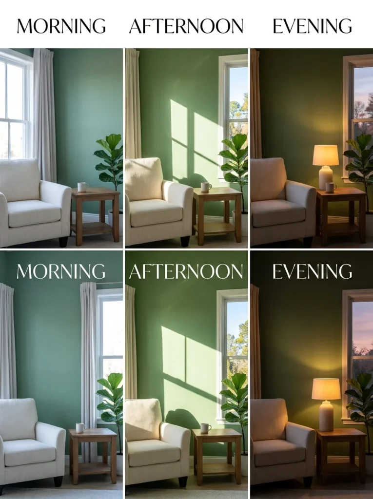
This is the step that would have saved me from my own repainting mistake: checking a paint sample only once, under whatever lighting happens to be available at that particular moment, misses how dramatically a color can shift between morning, midday, and evening light. Observing the same painted sample in the early morning, at midday, and again in the evening under your regular artificial lighting reveals the color’s full range of appearance, rather than just one potentially misleading snapshot.
Account for your artificial lighting, not just daylight
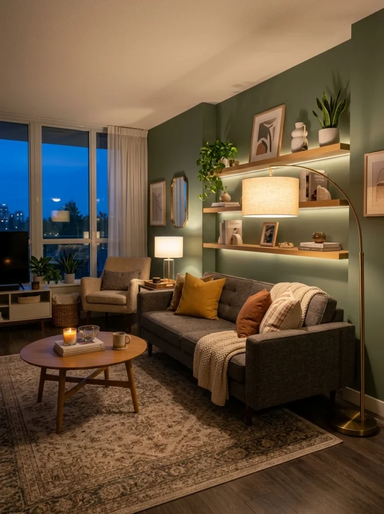
A living room’s paint color needs to work well under whatever artificial lighting you actually use in the evening, not just under daylight, since a significant portion of time spent in a living room happens after the sun goes down. Warm-toned bulbs tend to enhance warmer paint colors while potentially muting cooler ones, while cooler, daylight-toned bulbs can make a warm paint color feel slightly less cozy than it would under warmer artificial light. Testing your paint sample under your actual evening lighting setup, not just assuming daylight performance will translate directly, avoids an unpleasant surprise once the sun goes down.
Choose undertones carefully, especially for lighter colors
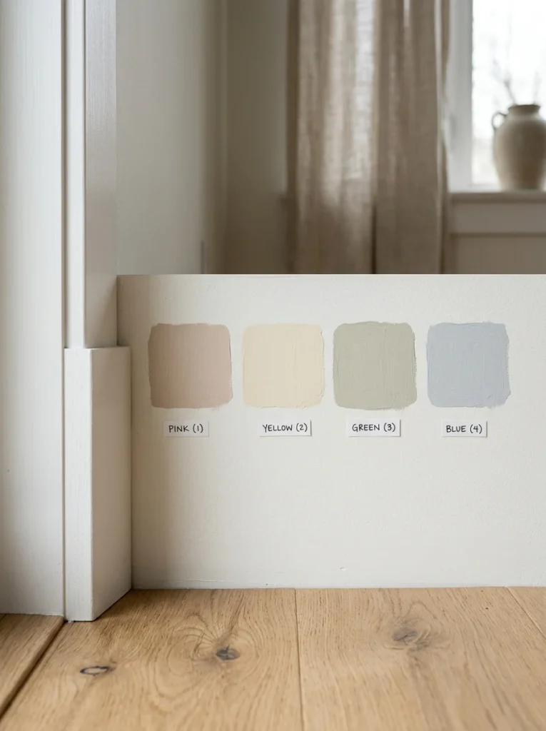
Lighter paint colors, whites, light greiges, soft creams, often carry subtle undertones, a hint of pink, green, blue, or yellow, that become considerably more noticeable once applied across an entire wall, even if that undertone was barely perceptible on the original small chip. Testing a color against your room’s existing fixed elements, flooring, trim, any built-in cabinetry, helps reveal whether a subtle undertone will clash or complement what’s already permanently in the room, which is considerably harder to judge from a small chip alone.
Consider how your existing furniture and decor interact with the color
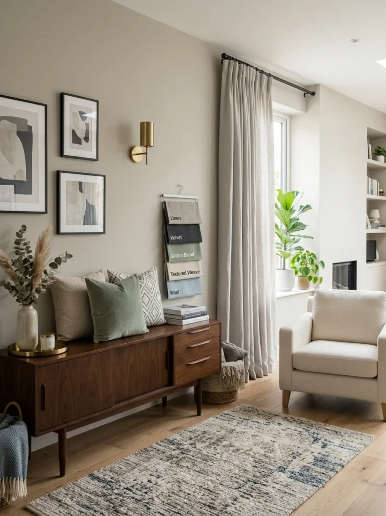
A paint color that looks beautiful in isolation can shift in perceived character once it’s reflecting light off your specific furniture, rugs, and decor throughout the room. Holding fabric swatches from your sofa or curtains up against a painted sample, rather than considering the wall color in isolation, gives a more accurate sense of how the finished room will actually look together, since paint color rarely exists in a vacuum separate from everything else already furnishing the space.
Choose a slightly muted tone if your room gets very strong light
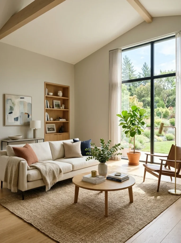
A room with intense, strong natural light, particularly a south-facing room with large windows, tends to make saturated colors appear even more vivid and can wash out or intensify a color beyond what was intended. Choosing a slightly more muted or greyed-down version of your desired color, rather than the most saturated version available, often results in a more balanced, livable outcome once that strong light hits the wall throughout the day.
Choose a warmer or more saturated tone if your room gets limited light
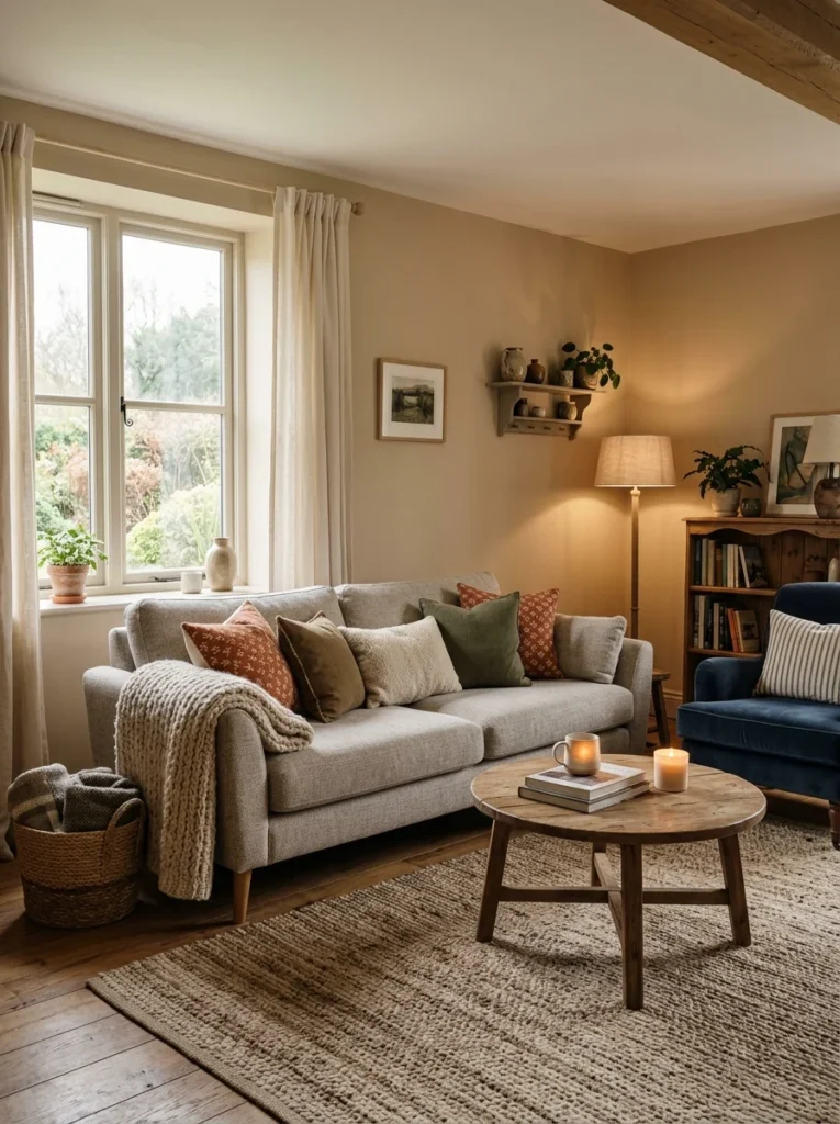
A room with limited natural light, a north-facing room, a room with small windows, or one significantly shaded by nearby trees or buildings, can make colors appear flatter, cooler, and sometimes duller than expected. Choosing a slightly warmer or more saturated version of your desired color than you might in a brighter room helps compensate for this effect, preventing the finished wall from reading as unexpectedly dull or lifeless once painted.
Use the same paint sheen you plan to use for the final coat
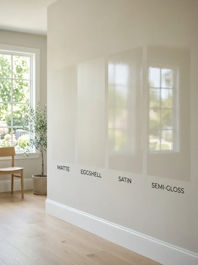
Paint sheen, matte, eggshell, satin, semi-gloss, affects how light reflects off the wall’s surface, which in turn affects how the color itself appears, sometimes fairly significantly between a flat matte finish and a glossier one. Testing your color sample in the exact sheen you plan to use for the final application avoids an unexpected shift in appearance between your test swatch and the finished walls, which can happen if the sample was tested in a different sheen purely for convenience.
Ask for a physical sample rather than relying purely on digital previews
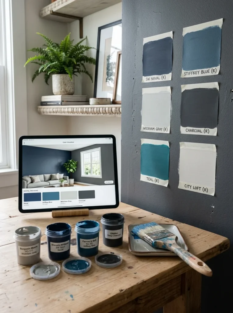
Digital color previews and online visualizer tools, while helpful for narrowing down initial options, can’t fully replicate how a specific paint formulation will actually look under your room’s real, physical lighting conditions. Most paint retailers offer small sample pots specifically for testing on your own walls, and investing in this small additional step before committing to gallons of paint for the whole room is a minor expense compared to the cost and effort of repainting an entire room that didn’t turn out as expected.
Think about the mood you want the room to convey, not just the color name
Beyond how a color physically performs under different lighting, consider the mood and feeling you actually want the living room to have, calm and airy, warm and cozy, bold and energetic, since this should guide your color family selection before you even get to the lighting-specific testing process. A soft blue-grey might technically perform well in your room’s lighting but still not deliver the cozy warmth you’re actually hoping for, so starting with the intended feeling and then narrowing down specific shades within that direction, tested properly against your room’s light, produces a more satisfying result than choosing purely based on which color happens to test most predictably.
Coordinate trim and ceiling color alongside your wall color decision
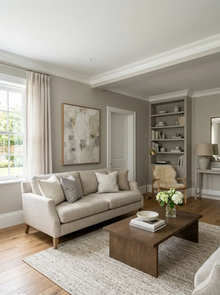
A wall color doesn’t exist in isolation from the trim, baseboards, and ceiling surrounding it, and testing a wall color without considering how it interacts with an existing white trim, or a cream ceiling color, can lead to a mismatch once everything is finished. If you’re also open to updating trim or ceiling color, testing your wall color sample alongside actual trim paint chips, or a small sample of the ceiling color, helps ensure the whole room’s palette works together cohesively rather than each element being chosen and tested in isolation from the others.
Why does my paint color look different at home than in the store?
Paint stores typically use consistent, often fluorescent lighting that doesn’t match the varying natural and artificial light in your actual living room, and a color’s undertones and saturation can shift considerably once applied to a full wall and viewed under your room’s specific lighting conditions throughout the day.
Should I choose a different paint color for a north-facing versus south-facing room?
It’s worth adjusting your approach based on orientation, since north-facing rooms tend to make colors appear cooler and flatter, often benefiting from a warmer or more saturated tone, while south-facing rooms receive strong, warm light that can intensify colors, sometimes calling for a more muted version of your chosen color.
How long should I test a paint sample before committing?
Observing the sample at multiple points throughout the day, morning, midday, and evening under your regular artificial lighting, over at least a few days gives a much more complete picture of how the color will actually perform than checking it only once under a single lighting condition.
Does paint sheen really affect how a color looks?
Yes, different sheens reflect light differently, which can noticeably change how saturated or muted a color appears. Testing your sample in the exact sheen you plan to use for the final coat avoids an unexpected shift in appearance between your test and the finished walls.
Should I test my wall color against the trim and ceiling too?
Yes, testing a wall color sample alongside the room’s existing or planned trim and ceiling colors helps confirm the whole palette works together cohesively, rather than discovering a mismatch only after the entire wall has already been painted.
Choosing a living room paint color that genuinely works across your room’s full range of lighting conditions comes down to understanding your room’s natural light direction, testing large samples directly on the wall at multiple times of day, and accounting for both natural and artificial lighting rather than relying on a small chip viewed under a single, often misleading light source. This extra care upfront costs a bit more time than simply picking a color and painting immediately, but it avoids the costly, frustrating experience of repainting an entire room that didn’t turn out the way you expected.
My own living room eventually landed on a warm, slightly muted greige after that first pink-tinged mistake, tested properly this time across a full day’s worth of changing light before a single gallon was purchased, and it’s held up beautifully in every lighting condition since. If you’re choosing your own living room color, resist the urge to decide from a small chip alone; a large sample tested on your actual wall across a full day will tell you far more than any store display ever could.