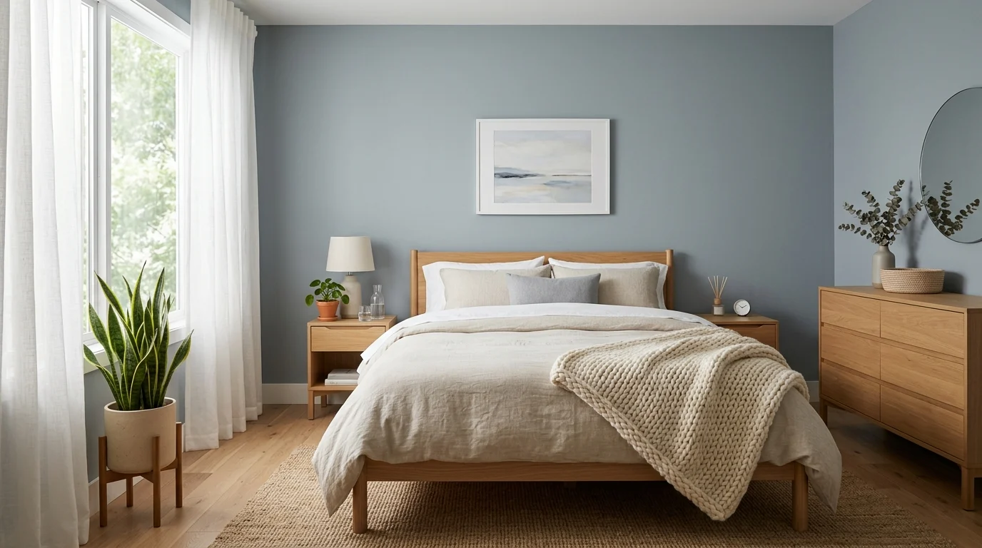
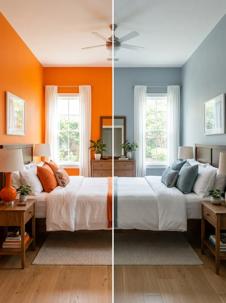
Years ago I painted our bedroom a bright, energetic orange, genuinely loving the color in every other context, only to notice within a couple of weeks that the room felt more stimulating than restful every time I walked in to wind down for the night. It took repainting to a much calmer, muted blue-grey before I actually noticed a difference in how quickly the room helped me settle into a restful state each evening. That experience made me genuinely curious about the relationship between bedroom color and sleep, beyond just personal taste, and what I learned changed how I’ve approached every bedroom color decision since.
While personal taste always matters, certain color choices genuinely tend to support a more restful bedroom atmosphere than others. Here’s what to consider when choosing a palette with sleep specifically in mind.
Understand why muted, softer tones generally work better than bright ones
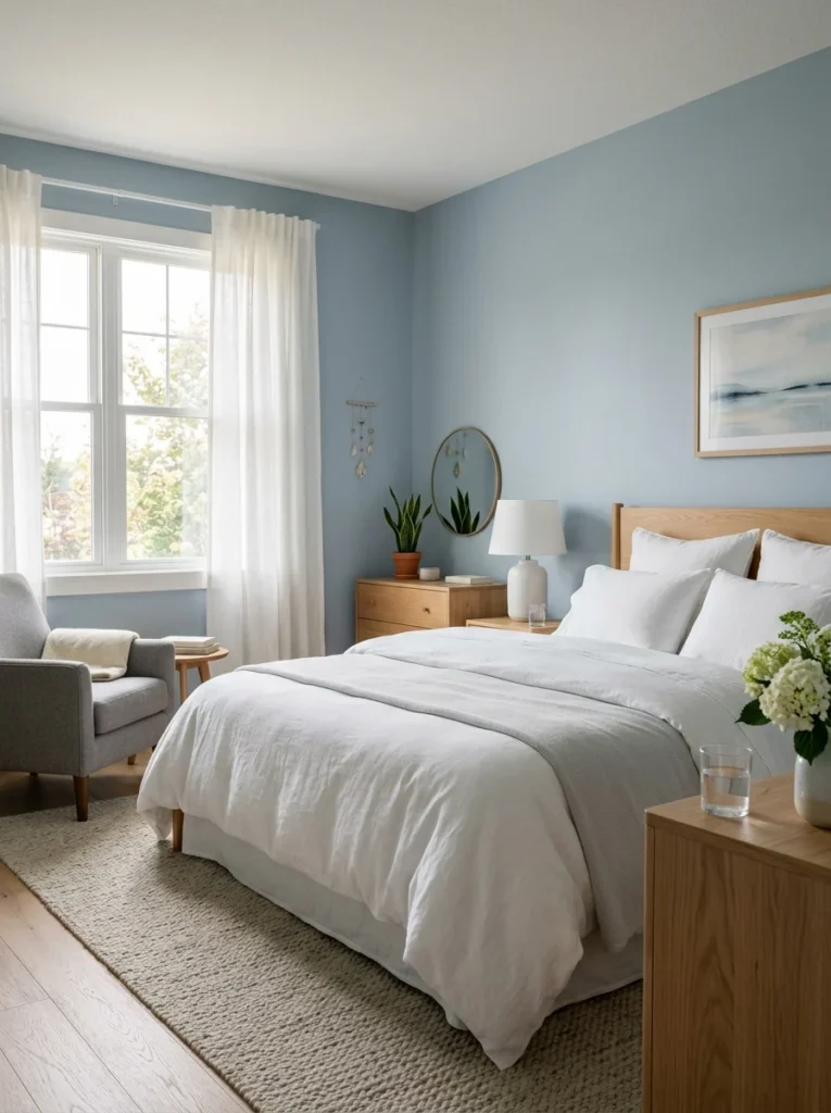
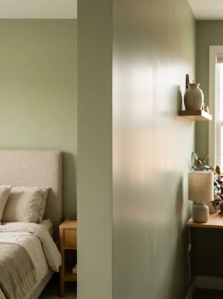
Bright, highly saturated colors tend to be visually stimulating and energizing, which is exactly the opposite of what a bedroom generally needs to support winding down in the evening. Muted, softer versions of colors, a dusty blue rather than a vibrant royal blue, a soft sage rather than a bright kelly green, tend to create a calmer visual environment more conducive to relaxation, even when the underlying color itself remains the same general hue you’re drawn to.
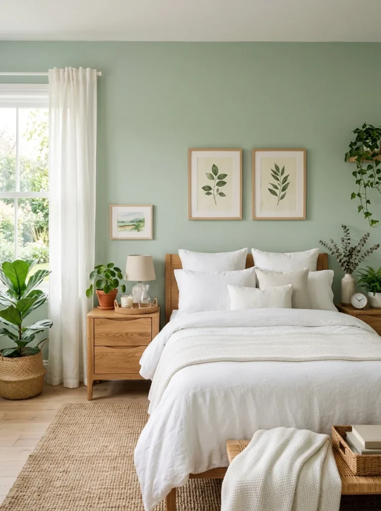
Consider cool blues and greens for their generally calming associations
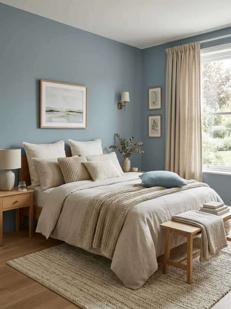
Cool tones, particularly soft blues and greens, are commonly associated with calm, natural environments, water, sky, plants, and many people find these colors genuinely soothing in a bedroom context specifically. These tones also tend to pair well with a wide range of bedding and furniture choices, making them a versatile, broadly appealing starting point for a sleep-focused palette.
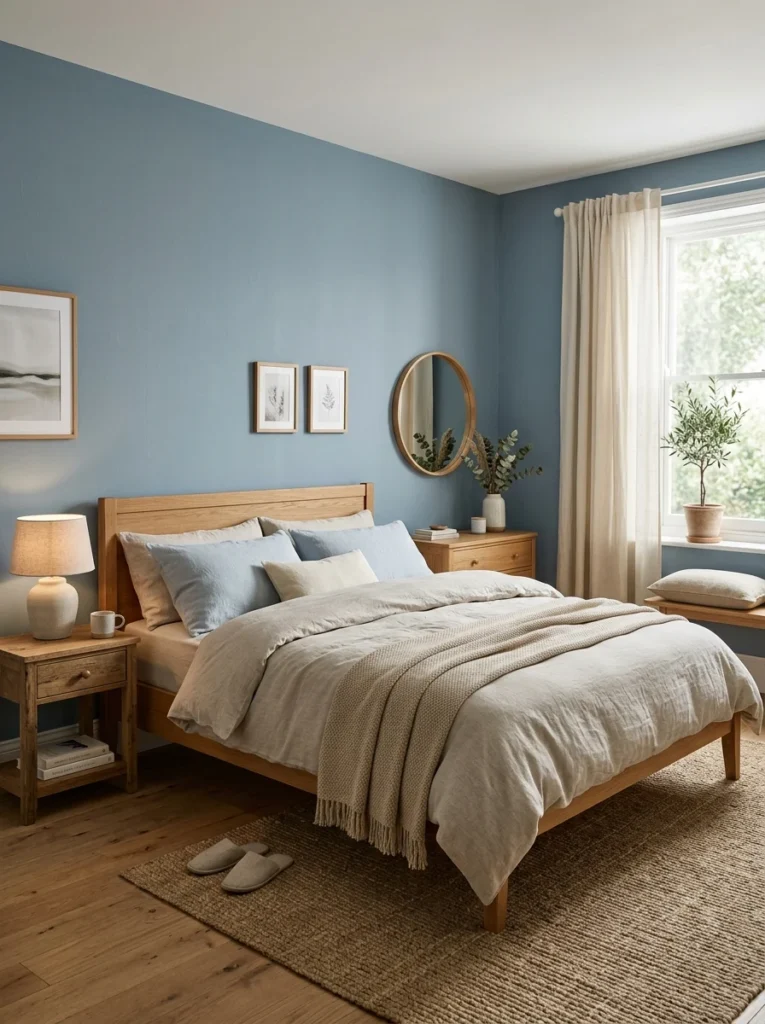
Explore warm, muted neutrals for a cozier, grounding feeling
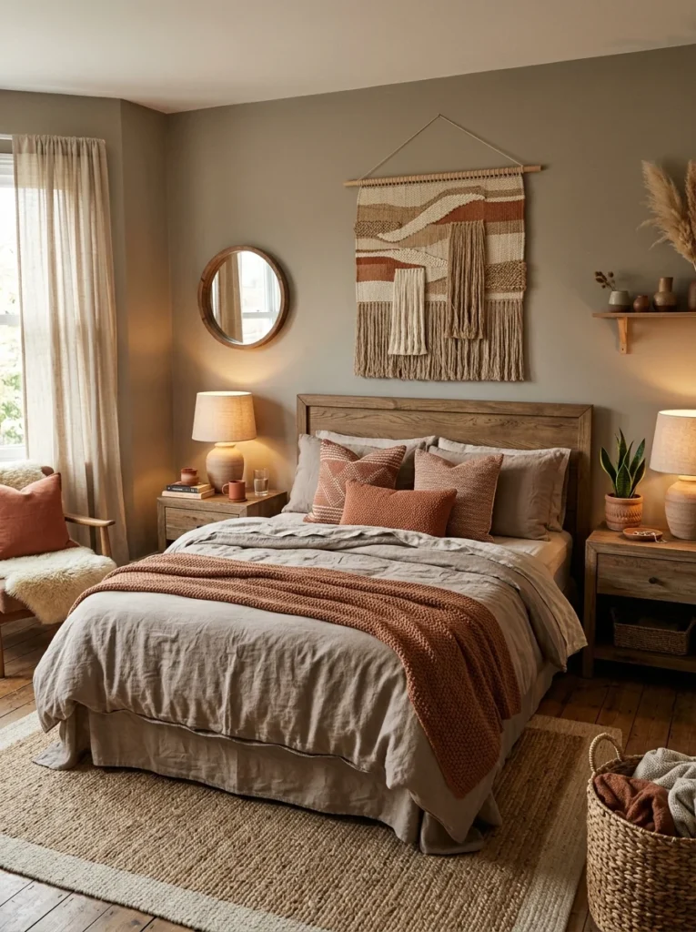
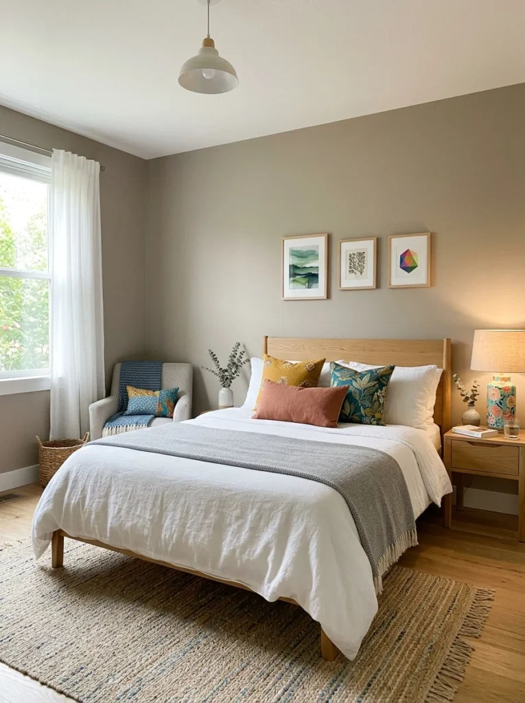
Soft, warm neutrals, a gentle taupe, a warm greige, a muted terracotta, offer a different but equally restful quality, creating a cozy, grounding atmosphere rather than the more airy, cool feeling blues and greens tend to provide. These tones work particularly well in a bedroom aiming for a warmer, more enveloping feeling than a cooler palette would deliver.
Be cautious with very bright or highly saturated colors as a dominant choice
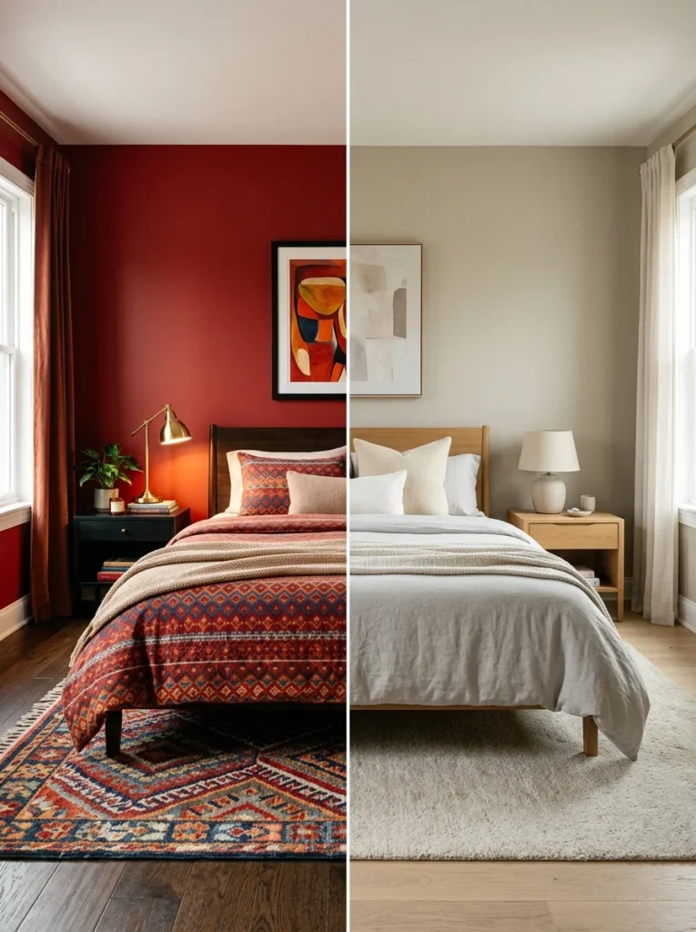
While an occasional bold accent can work well in a bedroom, using a bright, highly saturated color as the dominant wall color, vibrant reds, bright yellows, intense oranges, tends to work against the calming atmosphere most people want from this specific room, given how visually stimulating and energizing these colors generally read, regardless of how much someone might love that color in another context, a piece of art, an accent pillow, elsewhere in the home.
Consider your own personal associations and reactions to specific colors
General tendencies toward calming or stimulating colors are a useful starting guideline, but personal associations matter too; if a color you might expect to be calming actually carries a negative personal association for you specifically, a past home, an unrelated stressful memory, that personal reaction should reasonably override the general guideline, since a room’s restfulness ultimately depends on your own genuine experience of it.
Balance a calming wall color with your bedding and textile choices
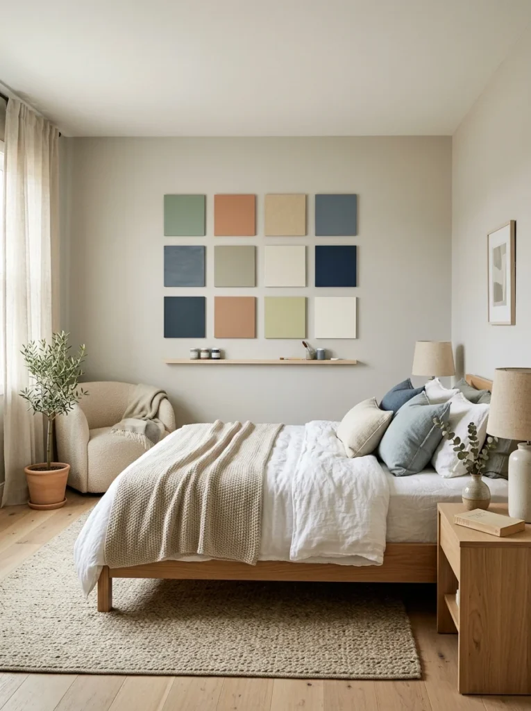
A calming wall color can be undermined by high-contrast, visually busy bedding or textiles layered on top of it, so considering the wall color and the room’s textiles together, rather than as entirely separate decisions, helps maintain a cohesive, genuinely restful atmosphere throughout the whole room rather than just the walls alone.
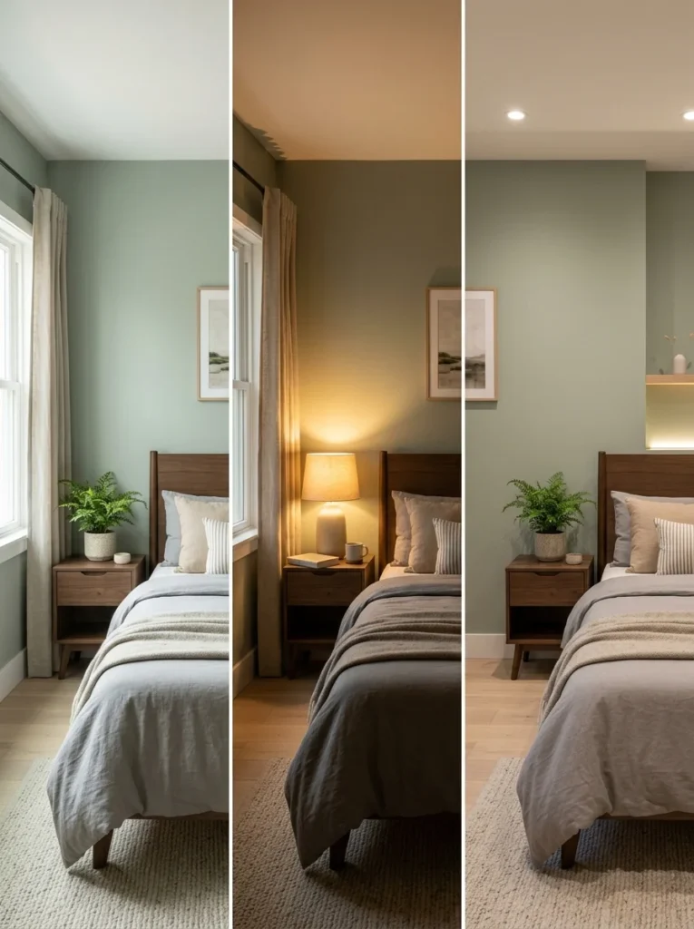
Consider how the color performs under your bedroom’s specific lighting
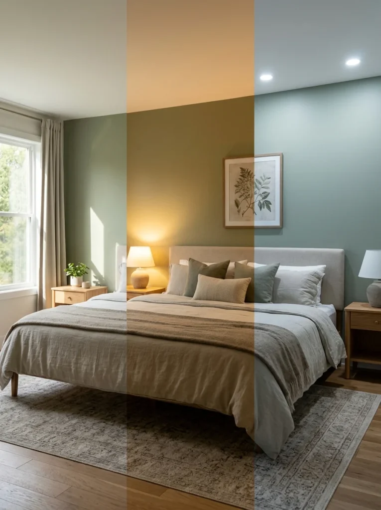
The same paint color can look and feel noticeably different under warm incandescent lighting, cooler LED lighting, or natural daylight, so testing a paint sample in your actual bedroom, at different times of day and under your actual light fixtures, rather than relying purely on how a color looks in a store or on a screen, ensures the final choice performs the way you expect once it’s actually painted and lived with.
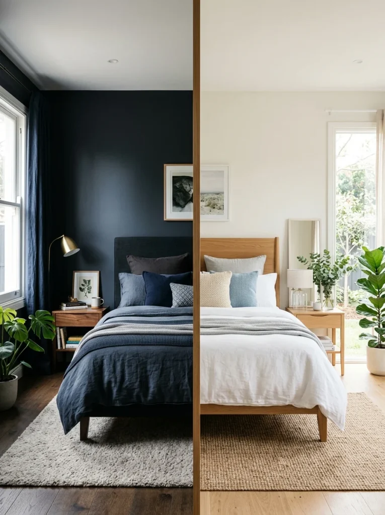
Think about how color affects the room’s sense of size and enclosure
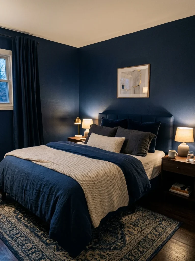
Darker colors can create a cozy, enveloping feeling that some people find genuinely restful, almost cave-like in a positive sense, while others find the same darker palette makes a room feel confining rather than calming. This is a genuinely personal preference rather than a universal rule, worth considering honestly based on your own reaction to darker, more enclosed-feeling spaces versus lighter, more open ones.
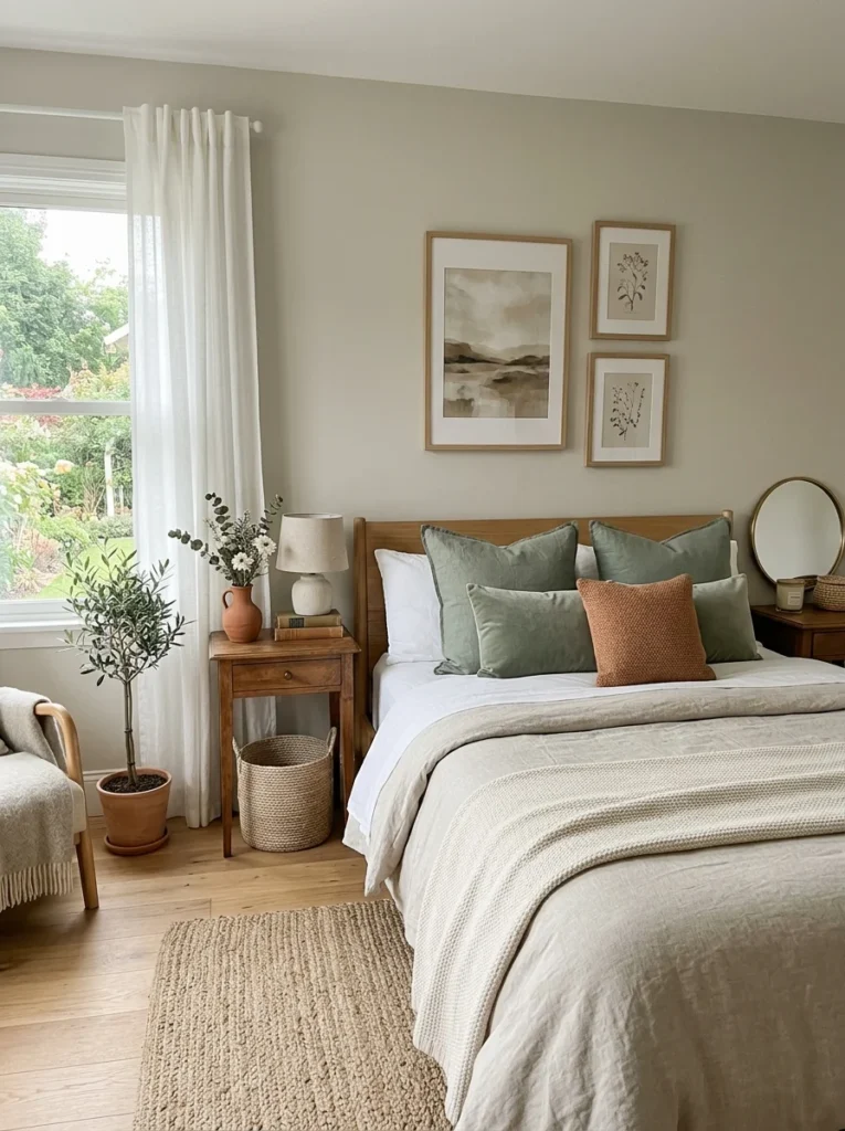
Use accent colors sparingly rather than avoiding color entirely
A calming bedroom palette doesn’t need to mean an entirely colorless, stark white room; a small amount of a more vibrant accent color, in a pillow, a piece of art, a lampshade, adds personality and visual interest without undermining the overall calming effect of a more muted, restful dominant palette surrounding it.
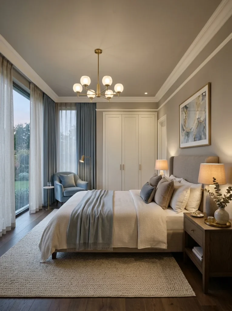
Consider the ceiling color as part of the overall palette
A stark white ceiling against softly colored walls can sometimes create more visual contrast than a genuinely calming room benefits from, and painting the ceiling a very soft, slightly tinted version of the wall color, or a warm off-white rather than a stark, bright white, can help the whole room feel more cohesively enveloping rather than having the ceiling read as a separate, disconnected element.
Choose a matte or eggshell finish over high-gloss for a calmer feel
Beyond the color itself, paint finish affects how a color reads in a room; a high-gloss or semi-gloss finish reflects more light and can create a brighter, more active visual quality, while a matte or eggshell finish absorbs more light and tends to support a softer, calmer overall impression, which generally aligns better with a restful bedroom’s intended atmosphere than a shinier, more reflective finish would.
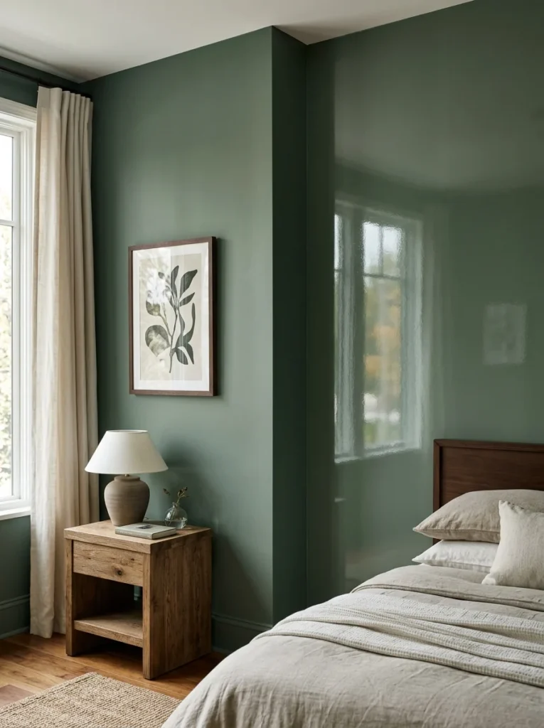
Think about how your color choice will look with natural light throughout the day
A bedroom’s color needs to work not just for its calming evening quality but also throughout the daytime hours the room is used, getting dressed, an afternoon nap, weekend relaxation, so considering how a chosen color performs across the full range of natural light your specific room receives throughout the day, not just in the evening when winding down for sleep matters most, ensures the palette works well for the room’s complete range of actual use.
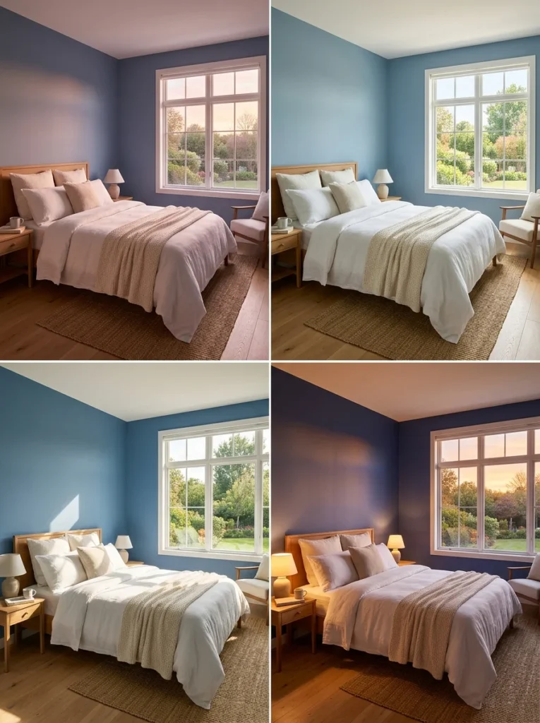
Avoid overly trend-driven colors if you want the palette to last
A color trend that feels exciting and current today may feel dated within just a few years, and since repainting a bedroom is a bigger undertaking than swapping smaller decor items, leaning toward a more timeless, muted palette for the walls themselves, while expressing any trend-driven color preferences through more easily changed elements like pillows or a lampshade, helps the room’s core palette remain genuinely restful and relevant for considerably longer.
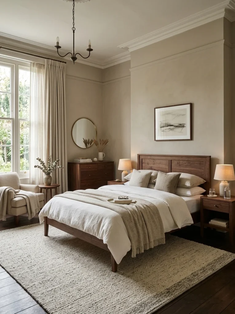
Test how a color affects your own actual sleep before fully committing
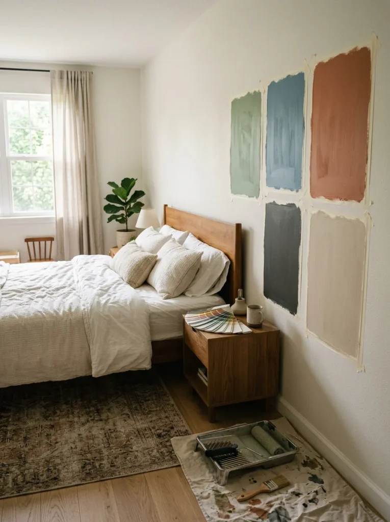
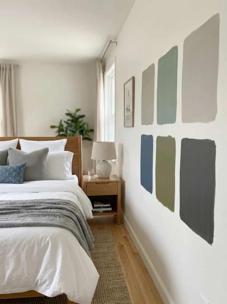
If you’re genuinely uncertain about a color choice specifically for its effect on your sleep, painting a large sample swatch directly on the bedroom wall and living with it for at least a week, actually sleeping in the room with that sample visible, provides far more useful, personal information than any general guideline about calming colors ever could, since your own actual experience is ultimately what matters most for this specific room.
What color is generally considered best for a restful bedroom?
Muted, cool tones like soft blues and greens are commonly associated with calm and are frequently recommended for bedrooms, though warm, muted neutrals also support a restful atmosphere with a cozier, more grounding quality rather than a cooler, airier one.
Should I avoid bright colors in a bedroom entirely?
Not necessarily as an accent; a small amount of a bolder color in a pillow, art, or a lampshade can add personality without undermining a calming atmosphere, but using a highly saturated, bright color as the dominant wall color tends to work against a restful feeling.
Does lighting affect how a bedroom color actually looks?
Yes, the same paint color can look noticeably different under warm incandescent lighting, cooler LED lighting, or natural daylight, so testing a sample in your actual room at different times of day helps ensure the final choice performs as expected once painted.
Is a dark bedroom color bad for sleep?
Not necessarily; some people find a darker, more enclosed-feeling palette genuinely cozy and restful, while others find it confining, making this a personal preference worth considering honestly rather than assuming darker colors are universally better or worse for a restful atmosphere.
Does paint finish matter for a bedroom’s calming effect, not just color?
Yes, a matte or eggshell finish absorbs more light and tends to support a softer, calmer impression than a high-gloss or semi-gloss finish, which reflects more light and can create a brighter, more visually active quality that works against a restful atmosphere.
Should I test a paint color before committing to a full bedroom repaint?
Yes, painting a large sample swatch directly on the wall and living with it for at least a week, actually sleeping in the room with it visible, provides far more useful personal information about how that color will genuinely affect your experience than any general color guideline alone.
A bedroom color palette that actually supports sleep generally favors muted, softer tones, cool blues and greens or warm neutrals, over bright, highly saturated colors that tend to feel more stimulating than restful. Personal associations and reactions to specific colors matter too, and testing a color under your room’s actual lighting ensures the final choice performs the way you expect.
Our bedroom’s current soft, muted blue-grey has made a genuine, noticeable difference in how the room feels to wind down in each evening, a considerable shift from that well-loved but ultimately too-stimulating orange from years earlier. If your own bedroom’s color still feels more energizing than restful, consider whether a more muted version of a color you love, rather than color itself being the issue, might deliver both the personality you want and the calmer atmosphere a bedroom genuinely benefits from.