Color is one of the most powerful tools in interior design, and in a living room it can either open up the space or close it in. The right paint color does not just look pretty — it changes how large the room feels, how much natural light bounces around, and how comfortable the atmosphere is. Understanding which colors work and why helps you make confident choices that transform the feel of your living room without a single structural change.
How Color Affects the Perception of Space
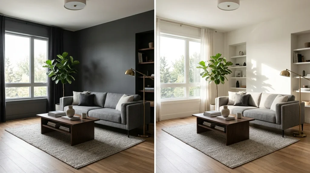
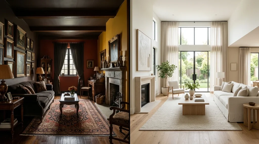
Light colors reflect more natural and artificial light, which causes the eye to perceive more depth. Dark colors absorb light and make surfaces appear closer, which can either create a cozy, intimate atmosphere or make a room feel smaller depending on how they are used. Understanding this principle is the foundation of every smart color decision.
The Best Colors to Make a Living Room Feel Bigger
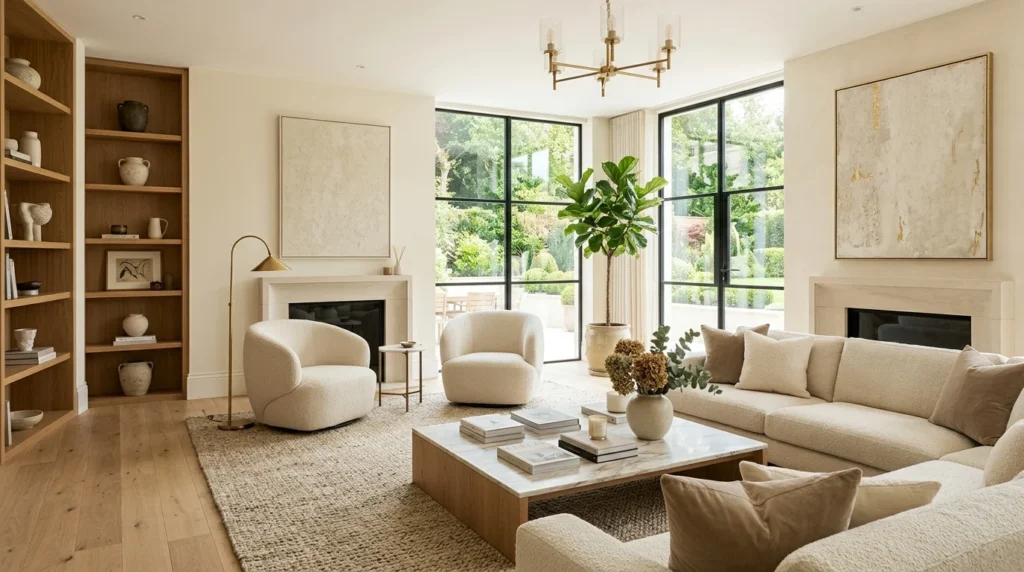
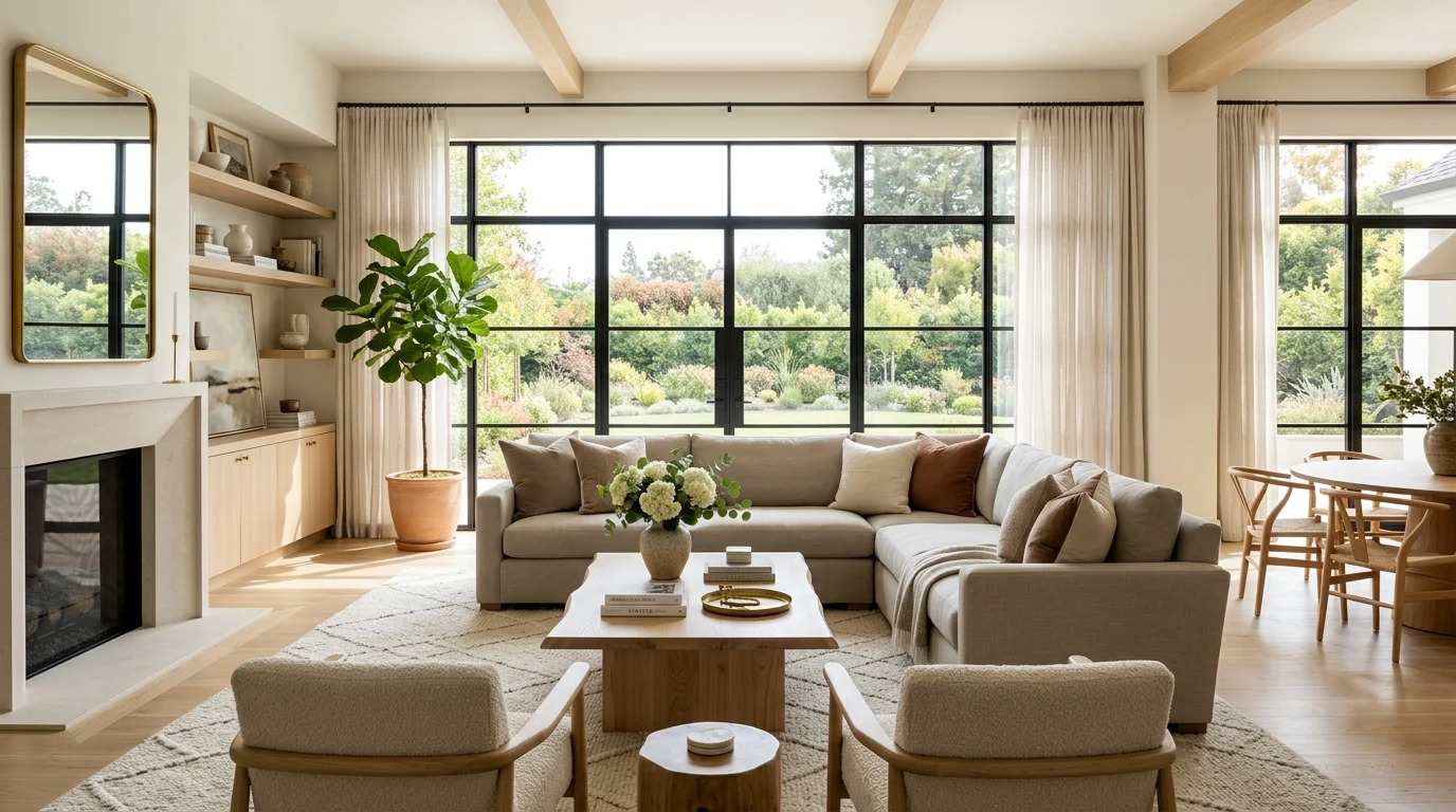
Choosing the right wall color can dramatically improve how spacious a room feels. Some shades naturally reflect more light while maintaining warmth and comfort.
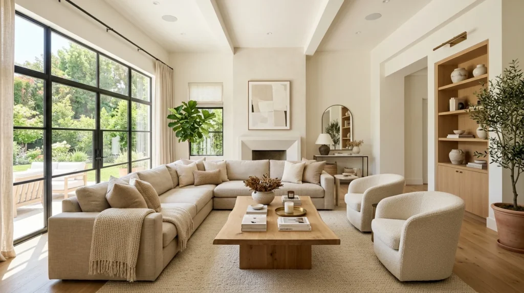
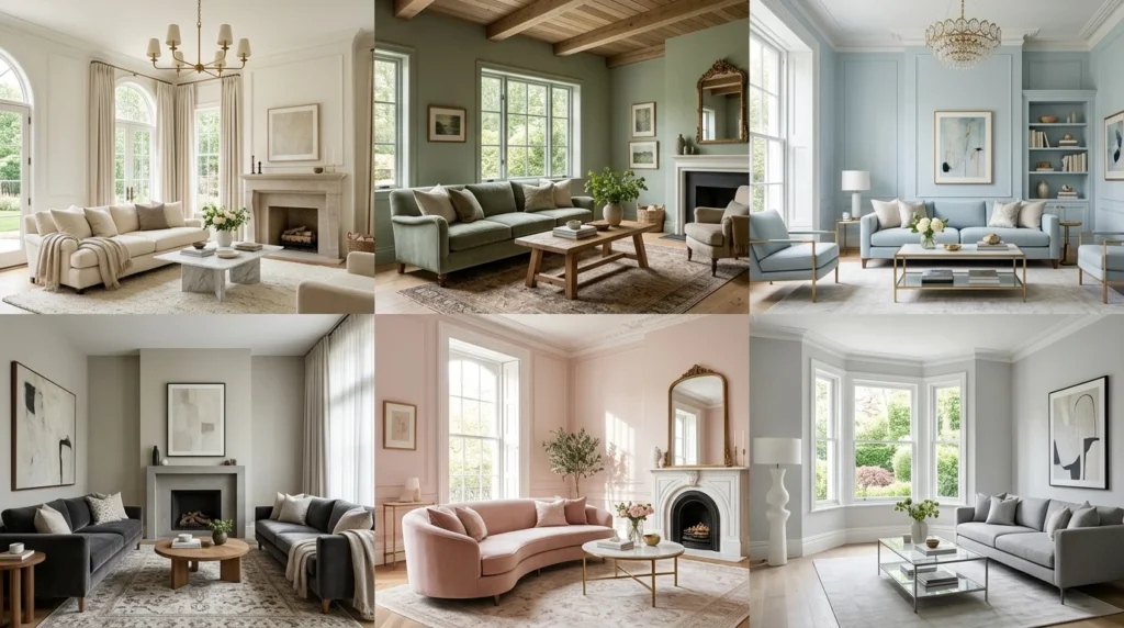
• Soft white with warm undertones (cream, linen, off-white): reflects light without feeling clinical.
• Pale grey with blue or green undertones: modern, calm, and visually recessive.
• Sage green: soft enough to feel light while adding natural warmth.
• Pale blue or sky blue: associated with openness and fresh air.
• Warm greige (grey-beige blend): versatile and timeless in almost every lighting condition.
• Soft blush or dusty rose: elegant and surprisingly spacious when used subtly.
Why Warm Whites Outperform Bright White in Living Rooms
Bright white walls often look stunning in magazines and professional photography, but they can feel cold and harsh in everyday living spaces. Warm whites with subtle yellow, peach, or pink undertones create a softer environment and reflect more flattering light throughout the room.
These tones make wood furniture look richer, soften shadows, and create the illusion of sunlight even in rooms that receive limited natural light.
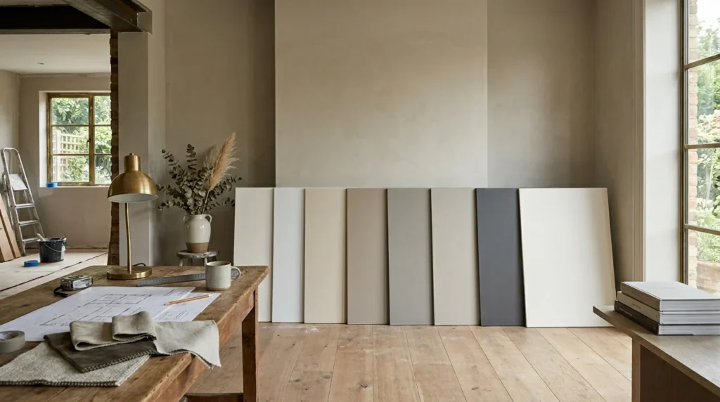
The Undertone Problem: Why Colors Look Different in Your Home
Every paint color contains an undertone that becomes visible once it is applied to your walls and exposed to your home’s lighting conditions. A gray paint sample that appears neutral in a showroom may look lavender, blue, or even green once painted in a living room.
Before committing to any paint color, test large samples on poster boards and observe them throughout the day. Morning, afternoon, and evening lighting can dramatically change the appearance of a color.
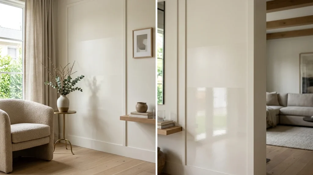
Paint Finish Matters as Much as Color
Choosing the correct finish is just as important as selecting the right shade.
Matte and eggshell finishes absorb light gently and help hide wall imperfections, making them ideal for most living rooms. Satin finishes reflect more light and can help a room appear slightly larger, but they also reveal wall flaws more easily.
Glossy wall finishes are generally best avoided because they create harsh reflections that can overwhelm the room and distract from the overall design.
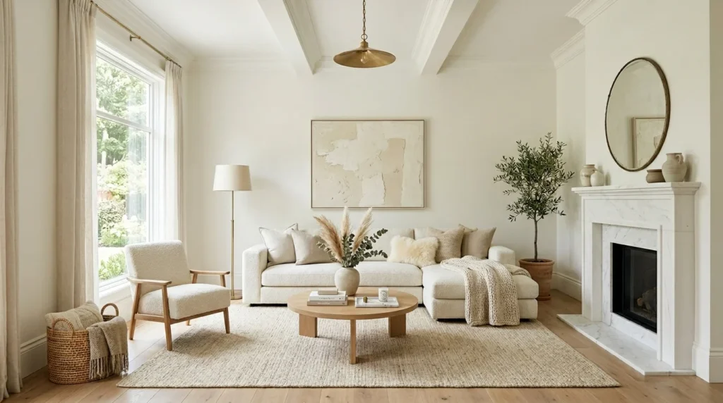
Using a Monochromatic Color Scheme to Expand the Space
One of the most effective designer tricks is using a monochromatic color palette. Painting walls, trim, and ceilings in similar tones reduces visual interruptions and creates a seamless flow throughout the room.
This technique removes hard visual boundaries and allows the eye to move continuously around the space, making the room feel larger and more cohesive.
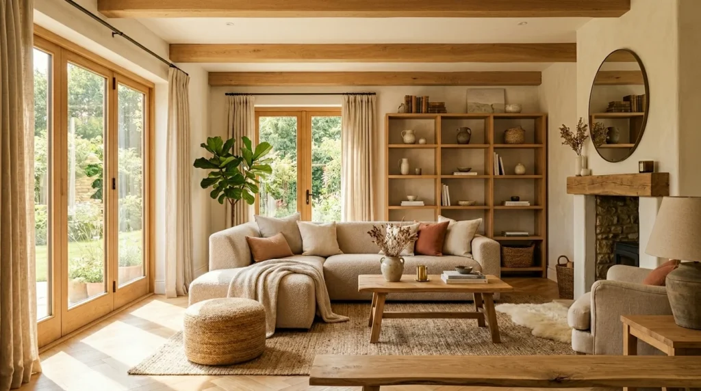
Warm whites, soft taupes, greige tones, and light sage shades work especially well in monochromatic interiors.
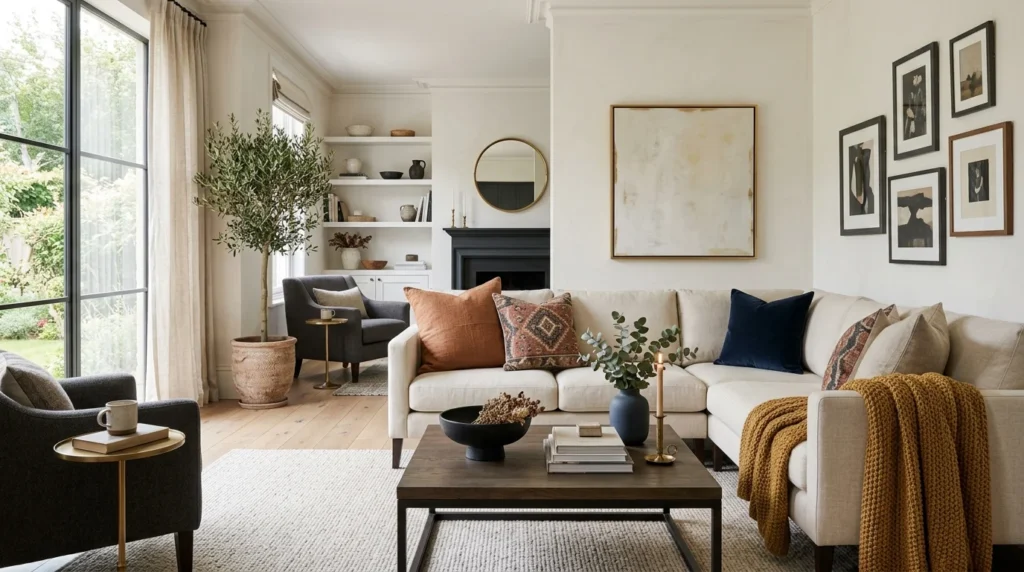
Accent Colors That Do Not Shrink the Room
Accent colors add personality without making a room feel crowded when used strategically.
• Terracotta and rust in cushions, artwork, and rugs.
• Navy or dark teal on one feature wall, such as behind a fireplace or television.
• Dusty mustard through textiles and decorative accessories.
• Charcoal accents in frames, lamps, and small decorative details.
These colors provide depth and contrast while preserving the room’s sense of openness.
Colors to Avoid in a Small Living Room
Not every color helps a room feel larger. Some shades can visually shrink the space when used excessively.
• Saturated red or orange across all walls.
• Dark chocolate or espresso brown covering the entire room.
• Bright yellow used as the dominant wall color.
• Multiple competing wall colors that create visual clutter.
These colors tend to advance toward the eye, absorb light, or create too many visual breaks, making a room feel smaller than it actually is.
Final Thoughts
The colors you choose for your living room have a direct impact on how spacious, bright, and welcoming the space feels. Light-reflecting shades such as warm white, greige, sage green, and pale blue help create an airy atmosphere, while thoughtful paint finishes and monochromatic palettes enhance the effect even further.
Before painting, always test samples in your room’s unique lighting conditions and focus on creating a cohesive color story. With the right combination of color, undertone, and finish, even the smallest living room can feel significantly larger and more inviting.